A truly minimalist color palette is not a stark white room. It is a deliberately layered set of 6 to 8 quiet tones that work together to make a space feel calm, spacious, and lived-in, rather than clinical. The difference between a minimalist home that feels serene and one that feels empty almost always comes down to undertone, contrast ratio, and texture, not the absence of color.
Below are the eight tones we return to again and again when styling rooms for the DecorQuarter editorial team, with the exact ratios, pairings, and price brackets you need to actually pull it off at home.
Key Takeaways
- A working minimalist color palette uses 8 tones split across the 60-30-10 rule, not just “white walls.”
- Undertone matching (all warm or all cool) matters more than choosing the “right” white.
- Three textures per surface keep a quiet palette from reading flat or sterile.
- Budget a paint sample run of $40 to $60 before committing – it pays for itself in avoided repaints.
Why a Minimalist Color Palette Is Never Just White
Pure white walls reflect roughly 80 to 90 percent of available light. In a room with abundant natural light, that creates glare and a cold, almost laboratory feel. In a low-light room, it goes the other way and reads dingy gray-blue by 4 p.m.
A working minimalist color palette solves both problems by introducing temperature (warm vs. cool undertones), value steps (light to dark in measured increments), and a single anchor tone that grounds the eye. Think of it as a quiet symphony rather than a single sustained note.
The three rules every minimalist palette follows:
-
One temperature family. Mixing warm whites with cool grays is the number one reason minimalist rooms feel “off.” Pick a lane.
-
Three value steps minimum. Lightest tone, mid-tone, and one deep anchor. Without contrast, the eye has nowhere to rest.
-
60-30-10 distribution. Dominant tone covers 60% of the room (walls, large rugs), secondary covers 30% (upholstery, curtains), accent covers 10% (art, ceramics, throws).
Actionable takeaway: Before you choose a single paint chip, decide warm or cool. Hold a sheet of printer paper next to your existing flooring. If the floor looks yellow or orange next to it, you are warm. If it looks gray or blue, you are cool. Build from there.
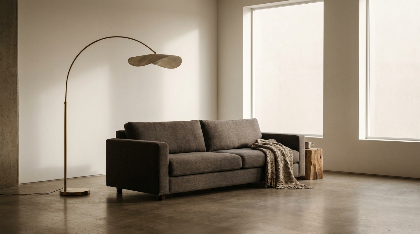
The 8 Tones That Make Up a Layered Minimalist Palette
These eight shades form a complete, flexible system. You will rarely use all eight in one room, but pulling six from this list guarantees harmony.
1. Warm White (the canvas)
Not Bright White, not Decorator White. You want a white with a barely perceptible yellow or pink undertone, around an LRV (Light Reflectance Value) of 82 to 88. Benjamin Moore White Dove OC-17 and Sherwin-Williams Alabaster SW 7008 are the workhorses. Use on 60% of wall surface and trim.
2. Soft Greige
The bridge between gray and beige. Sits at an LRV of around 60 to 65, which is light enough for walls but warm enough to avoid the “rental beige” trap. Look at Sherwin-Williams Accessible Beige SW 7036 or Farrow & Ball Skimming Stone.
3. Mushroom Taupe
A mid-value tone in the LRV 35 to 45 range. This is your secret weapon for an accent wall, a built-in, or a large upholstered piece. It reads brown in warm light and gray in cool light, which is exactly what you want.
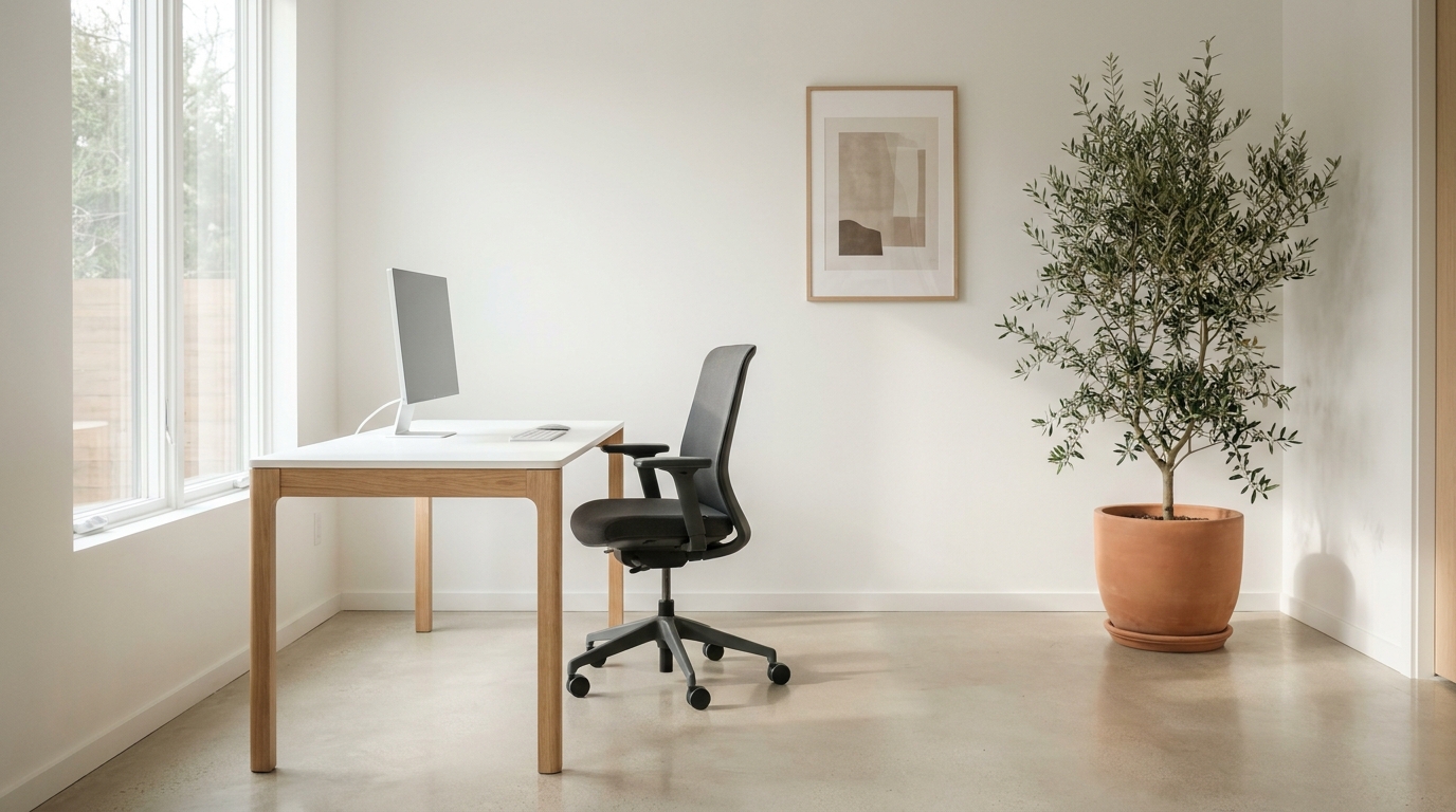
4. Pale Oat
A creamy, slightly yellow neutral that lives between white and beige. Use it on textiles – linen curtains, a slipcovered sofa, a chunky wool throw. It softens any room that risks tipping cold.
5. Misty Sage
The one “color” in the palette. A desaturated green-gray at roughly 8% to 12% saturation. It functions as a neutral while introducing the biophilic calm that pure neutrals cannot. Farrow & Ball Mizzle or Backdrop Olive Branch are reliable.
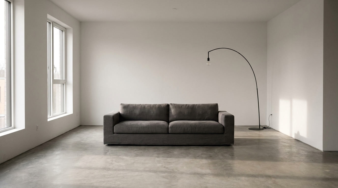
6. Smoky Charcoal
The anchor. Without it, the palette floats. Use sparingly – a black-iron floor lamp, a charcoal linen pillow, a single dark frame. LRV under 15.
7. Putty Pink
A barely-there blush with brown in it. Brings warmth to bedrooms and powder rooms without reading “pink.” Pair with the greige for adult sophistication.
8. Inky Navy or Deep Espresso
Choose one based on your temperature family. Cool palettes get navy; warm palettes get espresso. This is the second anchor, used on a single statement piece such as a media console or a leather chair.
Actionable takeaway: Pull six of these eight for any given room. A typical living room build looks like: Warm White (walls) + Pale Oat (sofa) + Soft Greige (rug) + Mushroom Taupe (curtains) + Misty Sage (plants and one art piece) + Smoky Charcoal (lamp and frames).
How to Build Your Palette in 6 Steps
This is the exact process we walk readers through. Block out an evening and do it in order – skipping steps is where most palettes fall apart.
-
Identify your fixed elements. Flooring, cabinetry, stone, and any furniture you are keeping. These set your temperature. You cannot fight oak floors with cool gray walls and win.
-
Choose your dominant white. Buy three sample pots ($6 to $9 each). Paint 2-foot squares on at least two walls. Live with them for 72 hours, observing at 9 a.m., 1 p.m., and 7 p.m.
-
Layer in your mid-tones. Pull greige and taupe samples. Hold them against the white at the wall. The transitions should feel quiet, not jarring.
-
Add one botanical or muted color. Misty sage, dusty blue, or putty pink. One. Not three.
-
Place your anchors. Identify the two spots in the room where a dark element will live. Sketch them in.
-
Stress-test with textiles. Bring home swatches of any fabric you plan to buy. If a fabric looks beautiful in the store but muddy at home, it is fighting your palette.
Actionable takeaway: Budget $40 to $60 for paint samples. This is non-negotiable. The cost of repainting a single room ($300 to $600 in paint plus labor or a weekend of your life) makes sample pots the highest-ROI purchase in the entire project.
Room-by-Room Application With Real Price Ranges
A minimalist color palette behaves differently in each room. Here is how the same eight tones translate across the house, with realistic budget brackets for the key pieces.
Living Room
- Walls: Warm white, two gallons paint – $80 to $140
- Sofa: Pale oat or soft greige in performance linen – $1,200 to $2,800
- Rug: Mushroom taupe wool, 8×10 – $400 to $1,400
- Accent chair: Smoky charcoal or espresso leather – $600 to $1,800
- Curtains: Pale oat linen, floor-length – $120 to $400 per panel
Bedroom
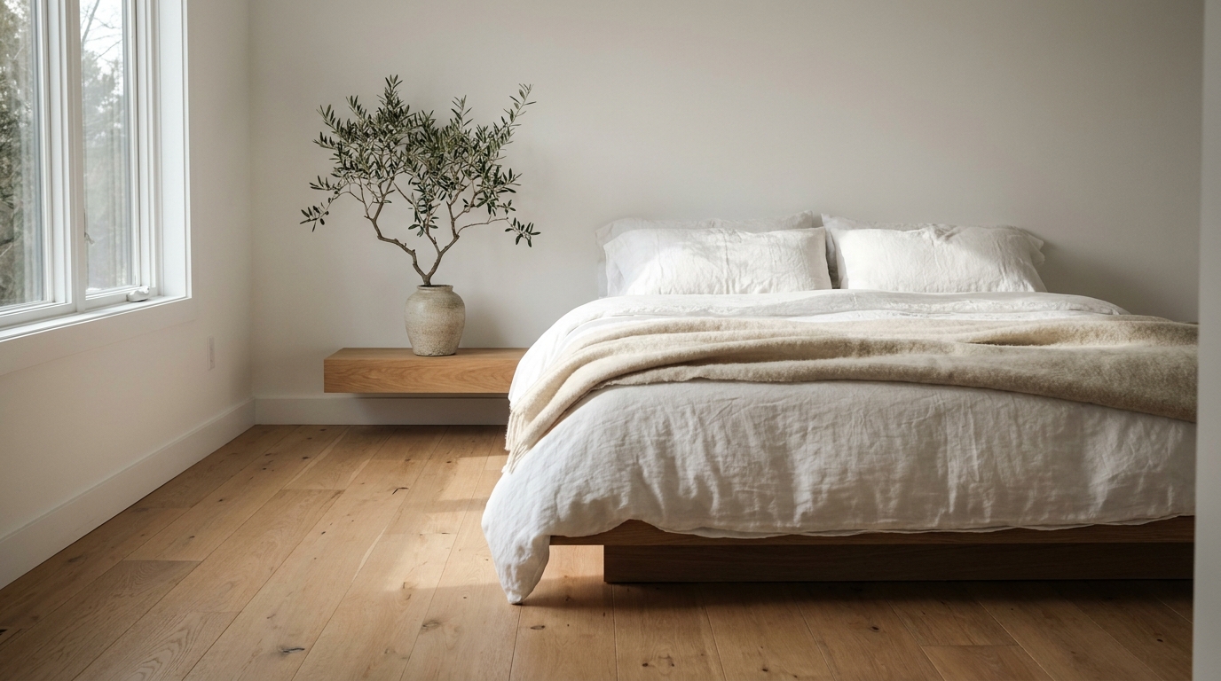
Bedrooms tolerate slightly more warmth. Push the putty pink and pale oat percentages up.
- Bedding: Pale oat duvet, white sheets, mushroom taupe throw – $250 to $650
- Headboard: Upholstered in soft greige – $300 to $900
- Nightstands: Espresso wood or matte black metal – $180 to $500 each
- Wall art: One large piece in mushroom and charcoal tones – $80 to $400
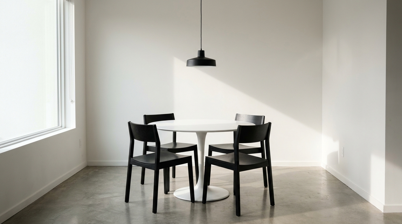
Kitchen and Dining
- Cabinets: Warm white uppers, soft greige or sage lowers (two-tone)
- Counter stools: Espresso or natural oak – $150 to $400 each
- Pendant lights: Smoky charcoal metal, 3 over island – $90 to $300 each
- Table linens: Pale oat runner, putty pink napkins for warmth
Bathroom
- Walls: Warm white above tile, misty sage below for a half-bath statement
- Vanity: Mushroom taupe or warm white shaker – $400 to $1,500
- Towels: Pale oat, putty pink, and one charcoal hand towel – $80 to $200 total
- Hardware: Matte black or unlacquered brass (pick one, never both)
Actionable takeaway: Spend the most on the largest surfaces (sofa, rug, walls) and the least on the smallest (cushions, ceramics, art). This is opposite to how most people instinctively budget, and it is the single biggest predictor of whether a minimalist room reads expensive.
Common Minimalist Color Mistakes (And How to Fix Them)
We see the same five mistakes again and again in reader photos.
Mistake 1: All-white everything. The fix is texture and value contrast. Add a chunky wool rug, a leather strap on a stool, and one piece of darkly stained wood. Aim for 20% of the visible surface area to be a mid-tone or darker.
Mistake 2: Mixing warm and cool whites. Trim in Decorator White (cool), walls in White Dove (warm). They argue. Standardize on one white across walls, trim, and ceiling.
Mistake 3: No anchor. A room with only light tones reads like a hotel lobby. Introduce smoky charcoal in at least two spots – a lamp base and a picture frame is enough.
Mistake 4: Too many “accent” colors. A minimalist palette has one botanical or muted color, not a sage pillow plus a dusty blue throw plus a terracotta vase. Pick one and repeat it three times.
Mistake 5: Forgetting the ceiling. A bright white ceiling above warm walls creates a hard line. Paint the ceiling the same warm white as the trim, or one shade lighter than the walls.
Actionable takeaway: Stand in the doorway of any room and count distinct color families. If you count more than four, remove one. The room will improve immediately.
How to Test Your Palette Before You Commit
The cheapest way to fail at a minimalist color palette is to buy first and test second. Use this 3-step verification before any purchase over $200.
-
The smartphone grayscale test. Photograph the room and switch the image to black-and-white. You should see a clear gradient of light-to-dark values. If everything looks the same shade of gray, you lack value contrast and the room will feel flat.
-
The squint test. Stand back, squint, and let the details blur. The dominant 60% tone should clearly take up roughly 60% of your visual field. If your accent color is shouting, it is too much.
-
The 24-hour test. Tape large fabric and paint samples in place. Live with them for a full day-night cycle before purchasing. North-facing rooms shift dramatically between morning and evening.
Actionable takeaway: Take one grayscale photo per room every time you add a new piece. If the value distribution changes for the worse, return the item within the retailer’s window. Most furniture stores allow 14 to 30 days.
Pulling It All Together
A minimalist color palette is not about restriction. It is about choosing eight tones, distributing them thoughtfully, and letting texture and natural light do the rest of the work. The rooms that feel most peaceful are not the emptiest – they are the most coordinated.
Start with the warm white. Add the greige. Layer in mushroom and pale oat. Introduce one botanical tone. Anchor with charcoal. Repeat across the house with subtle shifts in ratio per room. Within a weekend of sampling and a few months of intentional purchases, you will have a palette that grows with you for years.
For the broader framework that this palette fits into, see our full Modern Minimalist Decor Guide. And if your starting point is a cluttered room rather than a blank one, walk through our 6-step declutter and decorate process for beginners before you pick up a paintbrush.
About the author: The DecorQuarter Editorial Team specializes in modern minimalist and warm contemporary interiors. We test paint, fabric, and furniture in real homes before recommending them.