The Scandinavian color palette is built on three quiet families: cool whites that bounce low northern light, soft greys that ground a room without darkening it, and pale wood tones that bring organic warmth back into the mix. Get those three families right and almost anything you add — black accents, dusty blue, sage, terracotta — will look intentional.
This guide walks through nine specific shades that define authentic Nordic interiors, with paint codes, undertone notes, and exactly where each one works best.
Key Takeaways
- Cool whites (undertones in blue, grey, or green) are the backbone — never warm cream or builder beige
- Use 60-30-10: 60% white walls, 30% wood and soft grey, 10% black, charcoal, or muted accent
- Test undertones first: paint two coats on poster board and view in morning, afternoon, and evening light
- Pair light woods with cool whites, mid-tone woods with warm greiges, and dark woods sparingly as anchors
- Budget tip: a gallon of premium Scandi-friendly paint runs $55–$95; sample pots cost $6–$10
1. Why the Scandinavian Color Palette Looks So Different
Nordic interiors evolved around a single constraint: short winter days with weak, low-angle light. Walls had to amplify whatever sun came through the window, so painters reached for whites with cool undertones that wouldn’t read yellow under candlelight or overhead lamps.
That practical origin produced the look we recognize today — airy, slightly cold, but rescued from sterility by raw wood, wool, linen, and a single saturated accent. Compared to American “greige” interiors, the Scandinavian palette skews lighter, cooler, and more tonal (fewer colors, more variation within each color).
Actionable takeaway: Before you pick any color, identify your light direction. North- and east-facing rooms need warmer whites (a touch of greige). South- and west-facing rooms can handle the coolest, bluest whites without feeling clinical.
2. The 3 Cool Whites That Anchor Every Nordic Room
White is not one color. These three are the most-specified whites in Scandinavian interior projects and each has a distinct personality.
Farrow & Ball “All White” (No. 2005)
A pigment-free white with no undertone trickery. It’s the purest version of the Nordic wall — slightly cool in shade, slightly warm in sun. Best for living rooms and bedrooms with mixed light. Roughly $120 per gallon in the Estate Emulsion finish.
Jotun “Egghvit” (1624)
A Norwegian classic. Egghvit (“egg white”) has a barely perceptible green-grey undertone that reads chalky and matte even in eggshell finish. It’s the white you see in 90% of Oslo apartment listings for a reason. Around $70 per gallon where stocked in the US.
Sherwin-Williams “Pure White” (SW 7005)
The most accessible option in North America. Slightly warmer than Egghvit but far cleaner than “Alabaster” or “Snowbound.” Pairs beautifully with light oak. $55–$75 per gallon depending on finish.
Actionable takeaway: Buy a sample pot of all three, paint 12″x12″ squares on foam board, and tape them next to your largest wood element (floor, dining table, headboard). The white that disappears against the wood is the one that belongs in your room.
3. The 3 Greys That Add Depth Without Heaviness
Scandi grey is never battleship grey. It’s almost always a whitened grey — sometimes called “off-whites with attitude” — with subtle blue, green, or putty undertones.
Farrow & Ball “Cornforth White” (No. 228)
A mid-warm grey that behaves like a white in bright light and a soft grey at dusk. The single most useful trim and cabinetry color in the Nordic palette. $120 per gallon.
Benjamin Moore “Classic Gray” (OC-23)
Whisper-pale with a faint lavender undertone. Works as a full-room wall color when you want “barely there” depth — common in Stockholm bedrooms and reading nooks. $60–$80 per gallon.
Jotun “Antique Grey” (10678)
A dustier, slightly green-grey often used on kitchen cabinets and built-ins in Norwegian homes. Holds its character under both cool LED and warm incandescent light — rare for a grey. $70 per gallon.
Actionable takeaway: Use greys on surfaces you touch, not surfaces you walk past. Cabinet fronts, built-in shelves, a single feature wall behind a bed, or interior doors. Greys on every wall flatten the light.
4. The 3 Wood Tones That Define Nordic Warmth
Wood is the antidote to all that white. The Nordic palette traditionally favors three species, each with a distinct color signature.
Pale Ash or White Oak
The flagship Scandi wood. Cool, almost grey-blonde, with a tight straight grain. Reads as a “neutral” rather than a “warm” element, which is why it can dominate a room without making it feel rustic. Engineered white oak flooring runs $5–$12 per square foot; solid runs $8–$18.
European Beech
Pinker and warmer than oak, with a softer grain pattern. The signature of mid-century Danish furniture (think Wegner, Juhl). Use it sparingly — too much beech tips a room toward 1990s “blonde wood” territory. Beech dining chairs typically run $180–$450 each.
Smoked or Fumed Oak
A modern Nordic favorite for floors and statement furniture. Ammonia fuming darkens the tannins to a warm cocoa-brown without stain. Provides anchor weight against all that white. Expect $10–$20 per square foot for engineered smoked oak.
Actionable takeaway: Pick one dominant wood species per room and use it on at least two surfaces (e.g., floor + dining table, or shelves + bed frame). Mixing four wood tones in one room is the fastest way to break the Scandinavian look. For more on layering these woods correctly, see our Scandinavian living room ideas guide.
5. How to Combine the 9 Colors: The 60-30-10 Nordic Formula
The classic decorator rule maps cleanly onto Scandinavian interiors, but with a specific allocation:
-
60% Cool White — walls, ceiling, large textiles, main upholstery. Pick one white and use it everywhere; don’t mix Pure White and Egghvit in the same room.
-
30% Wood + Soft Grey — flooring, furniture frames, cabinetry, trim. This is your “secondary neutral” layer that prevents the room from feeling like a gallery.
-
10% Accent — matte black hardware, charcoal throws, a single dusty blue armchair, dried eucalyptus, or muted terracotta ceramics.
Step-by-Step Application
-
Paint the ceiling and walls in the same cool white — Nordic homes rarely use a separate “ceiling white.” A continuous envelope makes the room read larger.
-
Choose flooring next, because it’s the largest wood surface and dictates which whites and greys will harmonize.
-
Add one mid-grey element — kitchen island, bookshelf back, or interior door — to break up the white.
-
Layer textiles in cream, oat, and stone before adding any color.
-
Introduce the 10% accent last, and limit it to two or three placements (a chair, a vase, a piece of art).
Actionable takeaway: Resist the urge to add a second accent color. The Nordic look is tonal, not colorful. If you want more visual interest, add a third texture (boucle, sheepskin, woven rush) — not a third color.
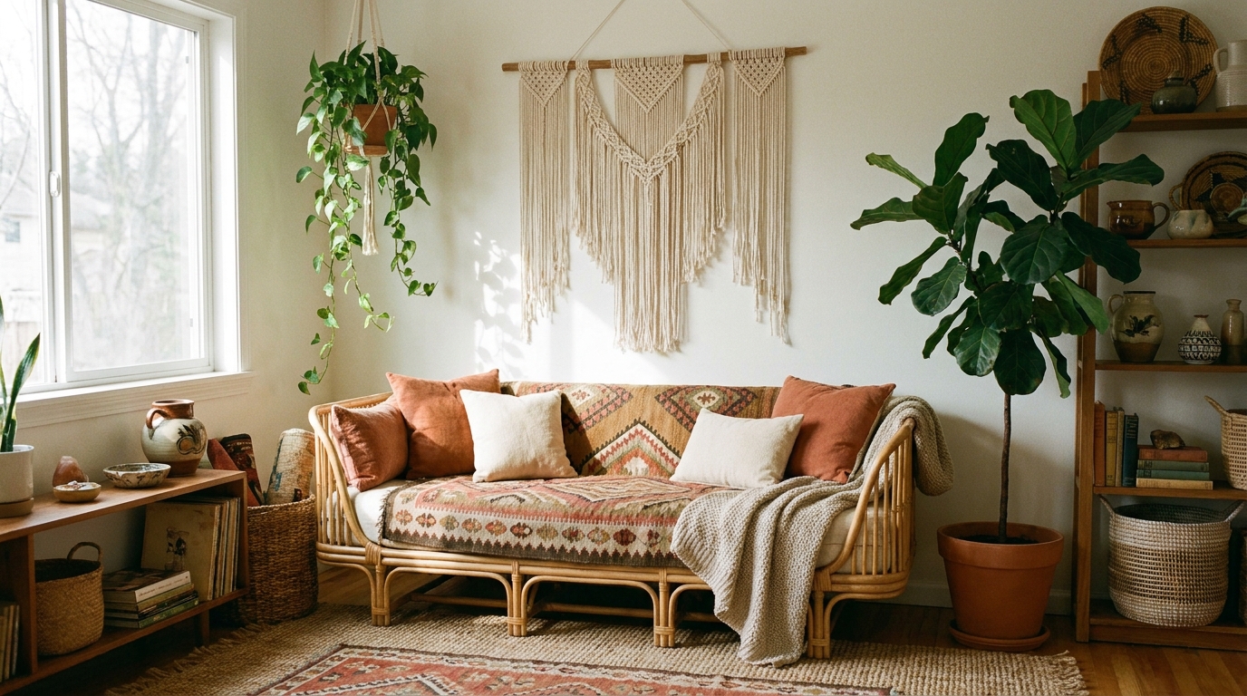
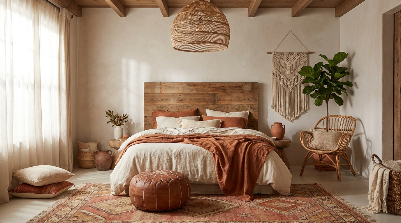
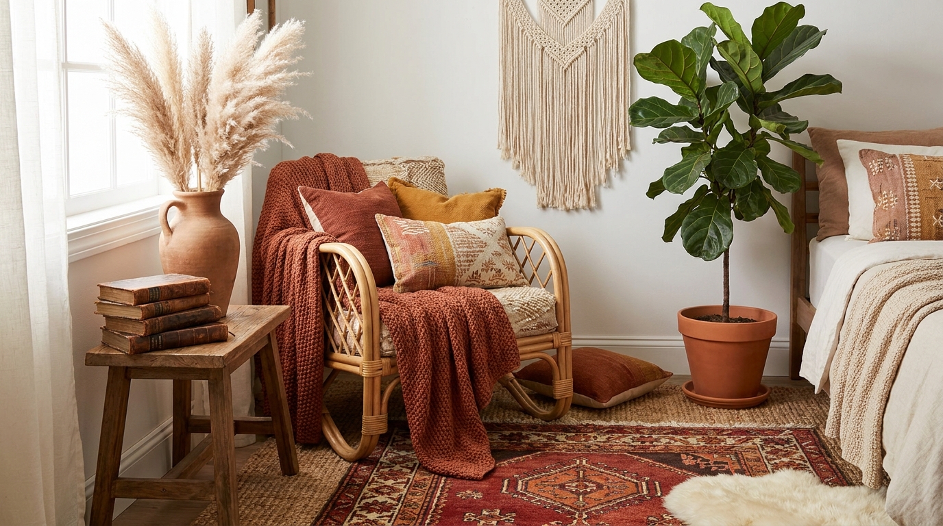
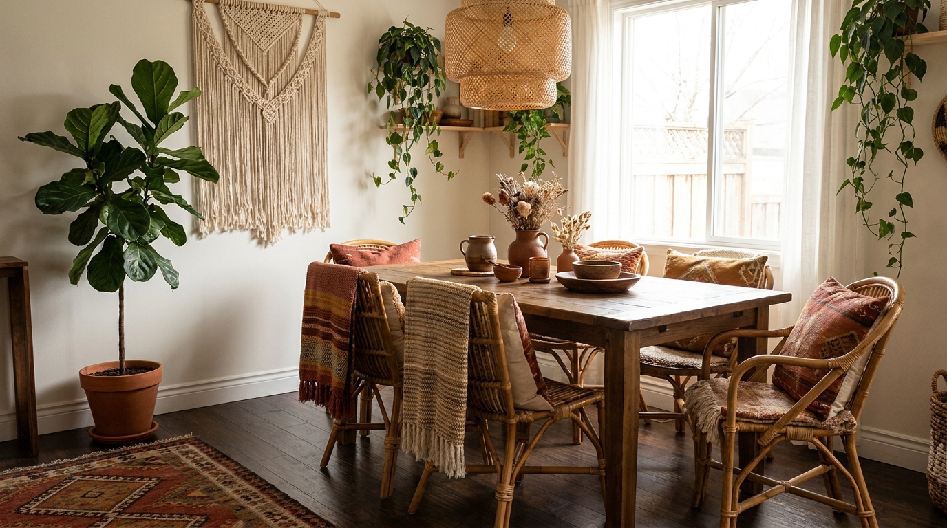
6. Room-by-Room: Where Each Color Works Best
Different rooms have different light, traffic, and emotional cues. Here’s how the nine colors distribute across a typical home.
| Room | Best White | Best Grey | Best Wood |
|---|---|---|---|
| Living Room | All White or Pure White | Cornforth White (trim) | White Oak floors |
| Bedroom | Classic Gray walls | Cornforth White trim | Smoked oak headboard |
| Kitchen | Egghvit walls | Antique Grey cabinets | Beech open shelving |
| Bathroom | Pure White | Classic Gray vanity | Pale ash accents |
| Home Office | Egghvit | Antique Grey built-ins | White oak desk |
Actionable takeaway: Bathrooms and kitchens — the rooms with the most hard surfaces and overhead lighting — benefit from the coolest whites (Egghvit, Pure White). Bedrooms and reading nooks, where you want softness, take the warmest of the cool whites (All White, with Cornforth trim).
7. The 7 Most Common Color Mistakes (And Fixes)
After reviewing dozens of “almost Scandinavian” rooms, these are the recurring errors that break the palette:
-
Using warm white (cream or ivory) on walls. Fix: switch to a cool white with grey, blue, or green undertones.
-
Pairing orange-toned wood (red oak, cherry, pine) with cool whites. Fix: refinish in a clear matte or whitewash, or swap to white oak.
-
Adding a second accent color. Fix: edit down to one — black, charcoal, or muted blue — and remove the rest.
-
Choosing grey flooring instead of wood. Fix: grey floors read as commercial. Use grey on cabinetry; keep floors wood.
-
Glossy finishes. Fix: matte or eggshell only. Satin is the maximum sheen for trim.
-
Stark white + black contrast with no mid-tones. Fix: add grey trim or grey textiles to bridge the contrast.
-
Skipping the warm element entirely. Fix: add jute, leather, brass, or sheepskin to break the chill.
Actionable takeaway: Photograph your room in black and white. If the image has only two values (pure white and pure black), you’re missing the mid-tone grey and wood layer that defines the style.
8. How to Test Your Palette Before You Commit
Paint manufacturers all sell sample pots for $6–$10. Use them.
-
Buy three sample pots: your top white, your top grey, your top accent.
-
Paint two coats on 24″x24″ foam boards (not directly on the wall — you want to move them around).
-
View each board against your floor, your largest furniture piece, and your main textile at three times of day: morning, midday, and evening with lamps on.
-
Eliminate any color that looks “off” in two of the three light conditions.
-
Live with the survivors for 48 hours before buying full gallons.
A full repaint costs $400–$1,200 in materials and $1,500–$4,000 in labor for an average room. A $30 sample exercise is the cheapest insurance you’ll ever buy.
Actionable takeaway: Always test the white and the trim color together. The interaction between the two is what defines the room — neither color exists in isolation.
9. Building the Rest of the Room Around the Palette
Once your nine colors are locked in, every other decision becomes easier:
- Hardware: matte black or brushed brass. Avoid polished chrome.
- Lighting: warm-white LEDs (2700K), never cool-white (4000K+) which fights the palette.
- Art: black-and-white photography, botanical line drawings, or a single oversized abstract in muted tones.
- Plants: olive, eucalyptus, fiddle leaf fig, pampas grass — all leaves that lean blue-green or silver, not bright kelly green.
- Textiles: linen, wool, boucle, sheepskin in cream, oat, charcoal, and the occasional dusty hue.
For a deeper breakdown of how these elements layer into a full room, see our 7-step beginner guide to decorating Scandinavian style and our complete Scandinavian decor guide for 2026. If you’re still deciding which Nordic philosophy fits your space, our breakdown of hygge vs. lagom vs. Nordic minimalism is the right next step.
Actionable takeaway: Write the nine color names on an index card and carry it when you shop. Every purchase — rug, lamp, vase, throw — should pass the test: “Does this fit within these nine colors, or is it asking me to add a tenth?” If it’s the tenth, leave it on the shelf.
FAQ
What are the main Scandinavian color palette colors?
The core Scandinavian color palette is built on cool whites (like Farrow & Ball All White or Sherwin-Williams Pure White), soft greys with whitened undertones (Cornforth White, Classic Gray), and pale wood tones (white oak, ash, and smoked oak), with optional accents of matte black or muted blue.
Is grey or white better for Scandinavian style?
White is the foundation — typically 60% of the room. Grey plays a supporting role on cabinetry, trim, or a single feature wall (around 10–20%). All-grey rooms read as industrial rather than Nordic.
What wood tones work best in a Scandinavian color palette?
Pale white oak and ash are the most authentic, followed by beech for furniture and smoked oak for anchor pieces. Avoid red-toned woods like cherry, mahogany, and orange-stained pine, which clash with cool Nordic whites.
Can I use color in a Scandinavian palette?
Yes — but limit it to one muted accent in roughly 10% of the room. Dusty blue, sage, soft terracotta, or muted mustard all work. Avoid saturated primary colors and more than one accent hue per room.
What’s the difference between Scandinavian and minimalist color palettes?
Minimalist palettes often allow stark black-white contrast with no mid-tones. Scandinavian palettes always include warm wood and soft grey to soften the contrast, making the space feel inhabited rather than gallery-like.
Ready to keep building your Nordic home? Start with our complete Scandinavian and Nordic decor guide for the full framework — furniture, lighting, textiles, and beyond.