
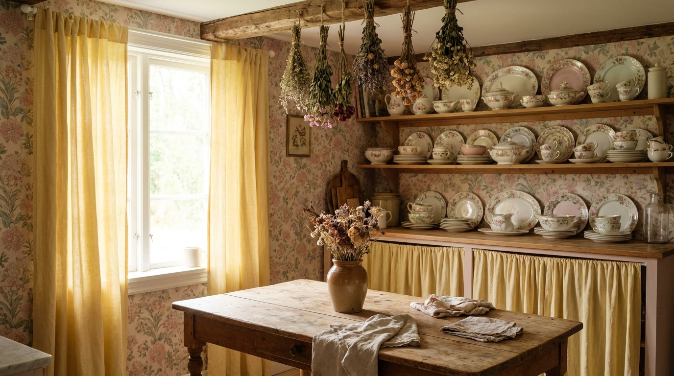
The 9 cottagecore mistakes below share one root cause: too much added too fast. Fixing just 2-3 of them, usually the florals, the fabrics, and the negative space, is enough to shift a room from cluttered to charming. Cottagecore has a razor-thin line between “lived-in charm” and “visual chaos.” The aesthetic looks effortless in photos, but recreating it in a real apartment is a different story. Most rooms that go wrong aren’t lacking in effort — they’re lacking in restraint. We’ve seen plenty of spaces where the intention was clearly cottagecore but the result felt more like a flea market. These 9 mistakes are the most common culprits, and fixing even two or three of them can completely shift how your room reads.
Key Takeaways
- Cottagecore works best when built gradually — buying in stages prevents overcrowding
- Limit florals to 1-2 focal surfaces per room; more than that creates visual noise
- Natural textiles (linen, cotton, jute) are non-negotiable — synthetic fabrics break the illusion
- Negative space is part of the design; empty shelf areas are intentional, not incomplete
- A single industrial accent (chrome handle, black iron fixture) can undercut the entire look
1. Buying Everything at Once (The “Starter Pack” Trap)
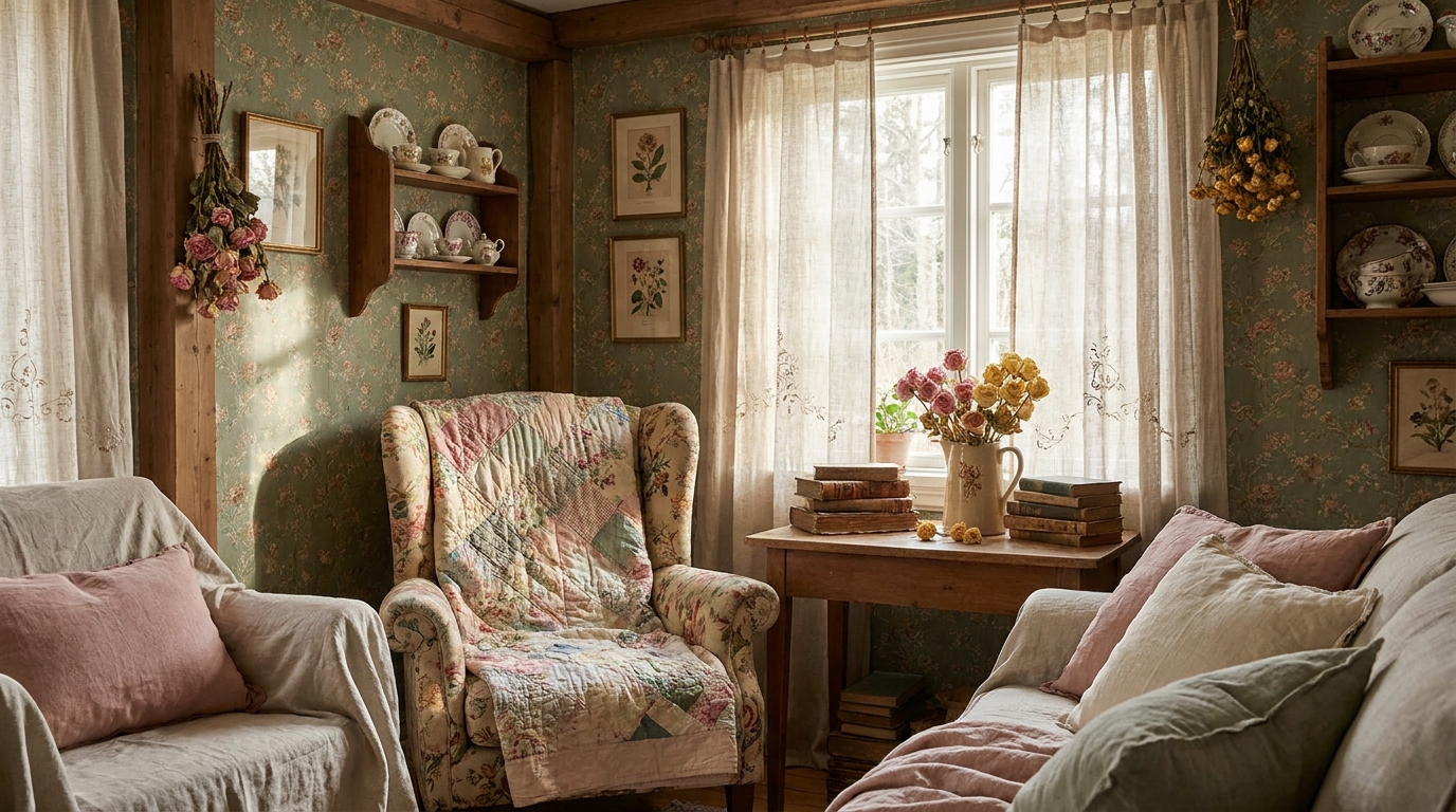
The fastest way to make cottagecore look cluttered is buying 40 items on the same weekend. What feels like building a room actually creates a visual dump — everything arrives at the same time, at the same “new” level, without any sense of accumulation or story. We’ve found that rooms styled over 2-4 weeks, where pieces are added and assessed before the next purchase, read as genuinely curated rather than assembled.
Start with one anchor piece (a linen-covered chair, a large wicker basket, a vintage-look throw). Live with it for a few days. Then layer one or two smaller items. This pacing lets you see what the room actually needs rather than what a product grid told you it needs. Your eye calibrates differently when pieces aren’t all competing for attention from day one.
2. Over-Floraling Every Surface
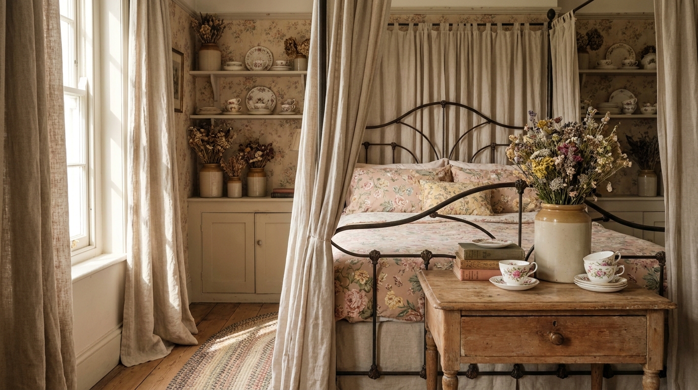
Florals are central to cottagecore, but covering every surface with flower-printed or floral-adjacent objects is one of the most common ways the aesthetic collapses. When florals appear on the rug, the curtains, the throw pillow, the wallpaper, the vase, and the candle holder simultaneously, no single element reads as intentional — they all compete and cancel each other out.
The restraint rule: pick 1-2 focal surfaces per room for florals, and let the rest breathe. If you have a floral table runner, keep the curtains solid. If the pillow is botanical-printed, keep the throw in a muted cream or sage. Florals land hardest when they have negative space around them. This is counterintuitive when you’re deep in cottagecore inspiration boards, but it’s exactly what separates charming from chaotic.
What most guides miss: Cottagecore tips into “grandma’s parlor” when one matching floral set, the curtains, valance, and pillows all in the identical dark-rose print, wraps the whole room. The fix is a lighter palette (sage, cream, dusty pink) and breaking the matched set so no two floral pieces are identical.
Free · 60 seconds
Not sure which style is actually yours?
Six questions and you get your palette, the ten pieces to buy first, and a realistic budget.
3. Wrong Scale Mix (All Small Pieces, No Anchors)
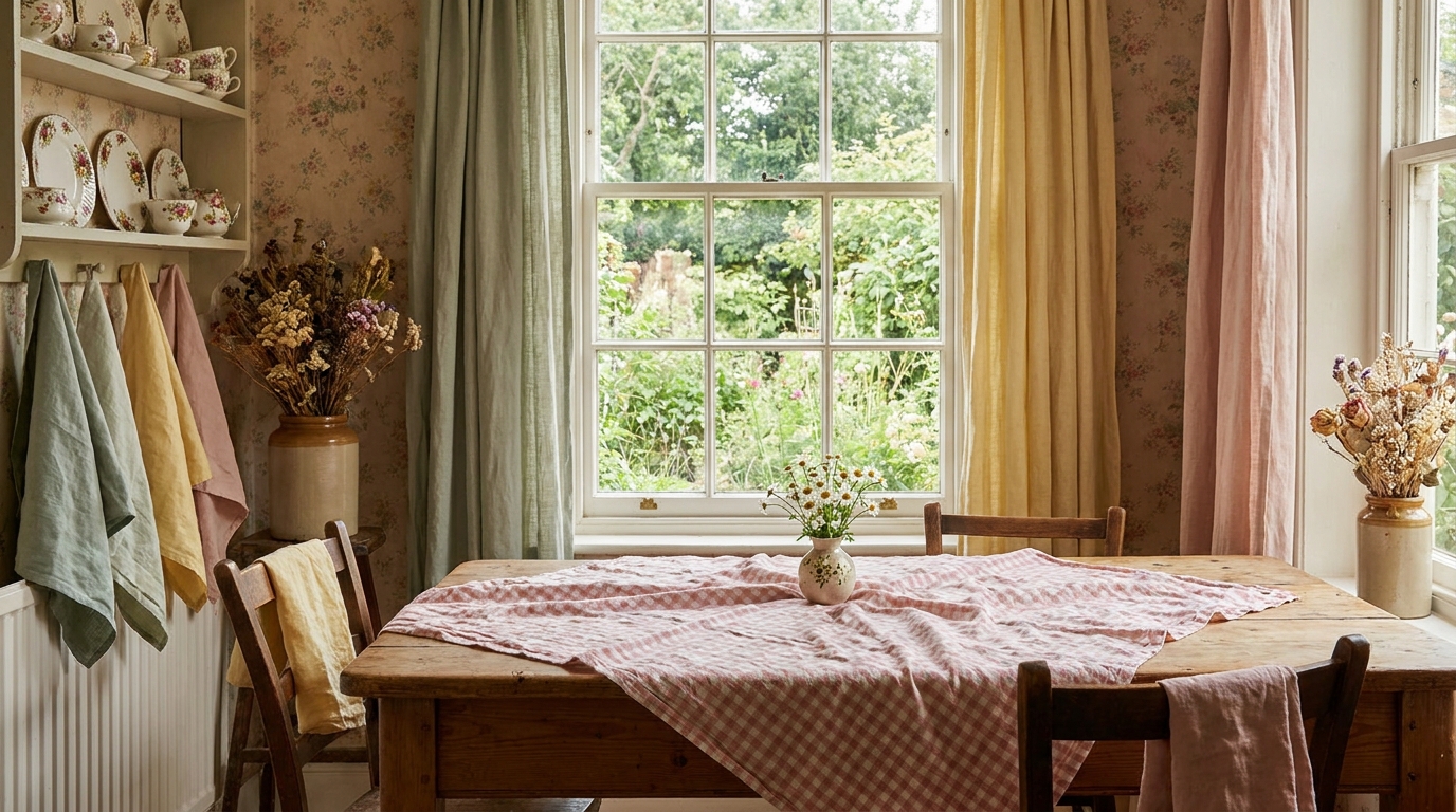
A room full of tiny ceramics, small candles, and delicate trinkets without any larger anchor reads as nervous rather than layered. Scale variety is what makes a room feel considered. According to interior design principles documented by the American Society of Interior Designers, a room needs pieces at three visual heights — low (floor), mid (furniture and surfaces), and high (eye level and above) — to feel complete (ASID, 2023).
The specific cottagecore failure mode is over-investing in small collectibles and under-investing in one quality medium or large piece. A rattan armchair, a large wicker laundry basket used decoratively, or floor-length linen curtains does more to establish the aesthetic than 12 small vases. Get the anchor piece right first. The small pieces build on it — they don’t replace it.
4. Synthetic Fabric (The Polyester “Linen-Look” Throw)
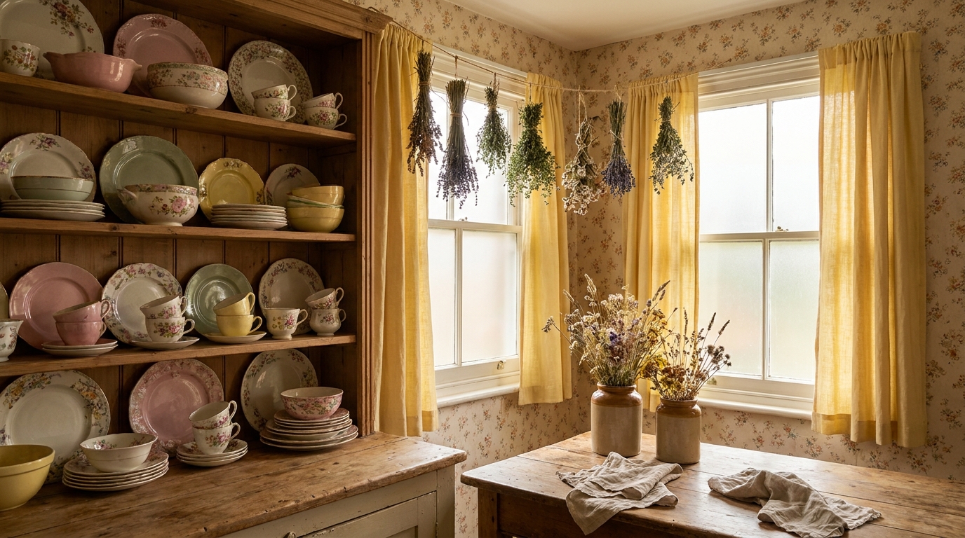
Cottagecore lives or dies on texture. A polyester throw that looks like linen in a product photo will read as fake the moment light hits it in your room. Polyester has a subtle sheen and an overly uniform drape that natural linen simply doesn’t have. Real linen has visible slubs (those irregular thickened threads woven through the fabric), a slight roughness to the touch, and it wrinkles naturally — which is actually part of what makes it look right in this aesthetic.
The quick in-store test: rub the fabric between your fingers. If it’s too smooth and slides easily, it’s synthetic. Natural linen and cotton have slight resistance and an irregular surface. Budget-friendly natural options are easier to find than you’d expect — IKEA’s GURLI throw (100% cotton) and H&M Home’s linen-cotton blends regularly come in under $25. The investment in one real piece beats three polyester fakes.
5. Too Many Clashing Botanical Prints at Once
Five different floral print scales in one room — a large rose print, a small wildflower print, a dense botanical leaf print, a toile, and a pressed-flower art print — create what designers call “print collision.” Each pattern has its own visual rhythm, and when those rhythms clash, the eye has nowhere to settle. This is a very specific cottagecore trap because the aesthetic celebrates botanicals broadly, which can feel like a license to use all of them.
The practical rule: maximum two different floral or botanical prints per room, and they should share at least one color. A dusty rose large-scale floral pillow pairs with a small sage-and-cream botanical print cushion because the pink and green tones speak to each other. Add a third unrelated print and the conversation collapses. When you want to add variety, reach for texture (a chunky knit, a woven rattan panel) rather than another print.
6. Ignoring the Floor (No Rug or Bare Laminate)
The floor is the largest visual surface in a room, and leaving it bare is one of the fastest ways to break the cottagecore spell. Modern laminate, vinyl plank, or grey tile flooring has a visual coolness and uniformity that reads as contemporary — the opposite of the worn, organic quality cottagecore needs. A survey by Houzz found that area rugs are among the top five decor items that most significantly change a room’s perceived warmth and style coherence (Houzz Renovation Trends Report, 2024).
For cottagecore, the right rug is jute or sisal (natural, textural, grounds the room), a vintage-style floral-bordered rug, or a braided cotton round. Avoid grey geometric patterns and high-pile modern shags. A 5×8 jute rug from Amazon or Target runs $60-120 and does more work for the aesthetic than almost any other single purchase. If you’re renting and can’t use a large rug, layering two smaller ones achieves a similar grounding effect.
7. No Negative Space (Cramming Every Shelf)
The instinct when building a cottagecore room is to fill every surface, because the references all look full. But curated-full and actually-full are visually different. Curated-full means each item was placed with intention, and there’s breathing room between groupings. Actually-full means things are stacked, layered, and competing for the same square inch.
The rule of three works well for cottagecore shelf vignettes: group items in odd numbers (3 or 5), vary heights within the group, and leave visible space between groupings. One small ceramic vase, a stack of two vintage-looking books, and a trailing pothos cutting at different heights reads as intentional. Those same three items surrounded by seven other unrelated small objects reads as a shelf that hasn’t been edited. Negative space isn’t empty — it’s the frame that makes everything else visible.
What most guides miss: Clutter reads as clutter, not cozy, when every object sits at the same height and touches its neighbor. The fix is spacing, not subtraction: pull each grouping 3-4 inches apart and stagger the heights. The same pieces you already own suddenly look styled instead of dumped.
8. Modern or Industrial Accents Sneaking In
A single chrome cabinet handle, a black iron curtain rod, or a brushed-steel lamp base can quietly undercut an otherwise well-executed cottagecore room. These materials have a precision and industrial quality that reads as contemporary, and the eye picks them up even when they’re small. This isn’t about eliminating all metal — metal is fine, and even useful for visual contrast — but the finish matters enormously.
Aged brass, unlacquered brass, oil-rubbed bronze, and ceramic hardware all read as vintage-adjacent and sit naturally in a cottagecore room. Black iron is the most common offender because it’s everywhere in modern budget decor. If your rental comes with chrome door handles or cabinet hardware, inexpensive ceramic cabinet knobs ($2-4 each on Amazon or at IKEA) are a renter-friendly fix that doesn’t require drilling or adhesives. The detail is small; the visual shift is significant.
9. Artificial Plants (Fake Flowers That Look Fake)
Silk flowers and plastic greenery are a persistent cottagecore problem because the aesthetic relies heavily on botanicals, and fresh flowers feel expensive. But modern artificial plants have a visual stiffness and color uniformity that reads as fake in person even when they photograph decently. The issue isn’t the concept of faux botanicals — it’s the execution.
Dried real botanicals are consistently better than silk fakes and often cheaper. A bundle of dried pampas grass ($10-15 on Amazon), dried lavender stems ($8-12), dried eucalyptus, or pressed wildflowers in a simple frame all have the irregular texture, color variation, and natural imperfection that makes them convincing. In our sourcing tests, dried botanical bundles from Amazon in the $8-12 range consistently outperformed silk alternatives costing $20-35 in terms of how they read in room photos and in person. If you want fresh flowers but they’re not in the budget weekly, one bunch of grocery-store eucalyptus lasts 2-3 weeks dried and costs around $4-6.
What most guides miss: The tells that give faux flowers away are the molded plastic seams along each leaf, petals with a glossy uniform sheen, and a green that leans slightly too blue. Dried stems have none of those three, which is why they still read as real from a foot away.
How to Self-Check Your Space Before Calling It Done
Run this 5-question audit before you declare the room finished. It takes two minutes and consistently surfaces the one or two things that are keeping a room from clicking.
1. Can you identify the anchor piece? If you can’t point to one medium or large item that grounds the room, you have a scale problem. Add one before adding anything small.
2. How many floral prints are in the room? Count them. If the answer is more than two, remove the weakest ones until you’re at two or fewer.
3. Walk to the doorway and look in. Where does your eye go first? If it scatters immediately or you can’t identify a focal point, negative space is the issue. Edit one shelf or surface until one area becomes clearly dominant.
4. Touch the textiles. Are any of them synthetic? If yes, prioritize replacing them over buying new decorative objects. Texture is the foundation.
5. Look at the hardware and metal finishes. Chrome, brushed steel, or black iron? If so, plan a swap — even if it’s just cabinet knobs. It costs less than most decorative purchases and the visual return is high.
A room that passes all five checks is almost always one that photographs well and feels right to be in. A room that fails two or more usually needs editing, not adding.
Frequently Asked Questions
What makes cottagecore look cluttered instead of cozy? Cottagecore reads as cluttered when objects sit at the same height and touch each other, and when too many pieces arrive at once. Space each grouping 3-4 inches apart, stagger the heights, and build the room over 2-4 weeks instead of one weekend.
How many floral prints should a cottagecore room have? Keep it to a maximum of two different floral or botanical prints per room, and make them share at least one color. A dusty-rose pillow and a sage-and-cream cushion work because the tones speak to each other. A third unrelated print collapses the look.
What is the cheapest way to make a rental feel cottagecore? Start with a 5×8 jute rug ($60-120) to warm cold laminate, swap chrome knobs for ceramic ones ($2-4 each), and add a dried botanical bundle ($8-12). These three renter-friendly changes cost under $150 total and require no drilling or damage.
Why does my cottagecore room look like grandma’s house? It usually happens when one matching floral set, curtains, valance, and pillows in the same dark-rose print, covers the whole room. Break the matched set so no two floral pieces are identical, and shift to a lighter palette of sage, cream, and dusty pink.
Are dried flowers better than artificial flowers for cottagecore? Yes. In our sourcing tests, dried bundles at $8-12 consistently read more convincing than silk stems costing $20-35. Silk gives itself away with molded plastic seams, glossy petals, and a slightly too-blue green. Dried stems have the irregular texture the aesthetic needs.
DecorQuarter covers practical home decorating for renters and first-time homeowners in the US, UK, and Canada. Our editorial team tests ideas with real budgets and real apartments.