Here is the frustrating truth about Japandi: rooms that look effortlessly serene in photos are deceptively hard to pull off in real life. We photographed 28 client Japandi attempts in 2025-2026 and tracked the most common visual problems. Rooms that felt wrong almost always shared the same cluster of errors: competing wood tones, sterile color palettes, misread wabi-sabi, and lighting that killed the warmth.
Japandi pulls Japanese minimalism (negative space, restraint, natural materials) and Scandinavian hygge (warmth, livability, soft texture) into one coherent visual language. In practice, most first attempts land somewhere between “cold Scandi office” and “wabi-sabi yard sale.”
Each mistake below comes with a visible symptom you can identify right now, a root cause, and a fix completable in under four hours. If you are just getting started, read our complete Japandi style guide first, then come back here.
Key Takeaways
- Wood tone conflicts (3+ competing tones) are the single most common problem, and the most visually destructive
- Cool-only color palettes read as clinical, not calm; one warm neutral swap changes everything
- Wabi-sabi is not a license to display every imperfect object: one per zone, maximum
- Bulb temperature is the most-ignored fix — 2700K warm white costs $24 and transforms photos
- Empty floors read as unfinished, not minimalist; a rug is a structural anchor, not clutter
How to Read This Guide
Each mistake follows a three-part structure: symptom, cause, fix. The symptom is what you see (or photograph). The cause is the specific decision that created it. The fix is concrete, with approximate cost and time.
Mistakes are ranked by frequency. Mistake #4 (lighting temperature) and mistake #8 (empty floors) are worth reading early regardless, because they affect how every other change reads in photos. You do not need to fix all nine. Identifying your top two or three gets you 80% of the result. If you have four or more issues, skip to the “What If You Have 4+ of These?” section first.
The 9 Japandi Mistakes
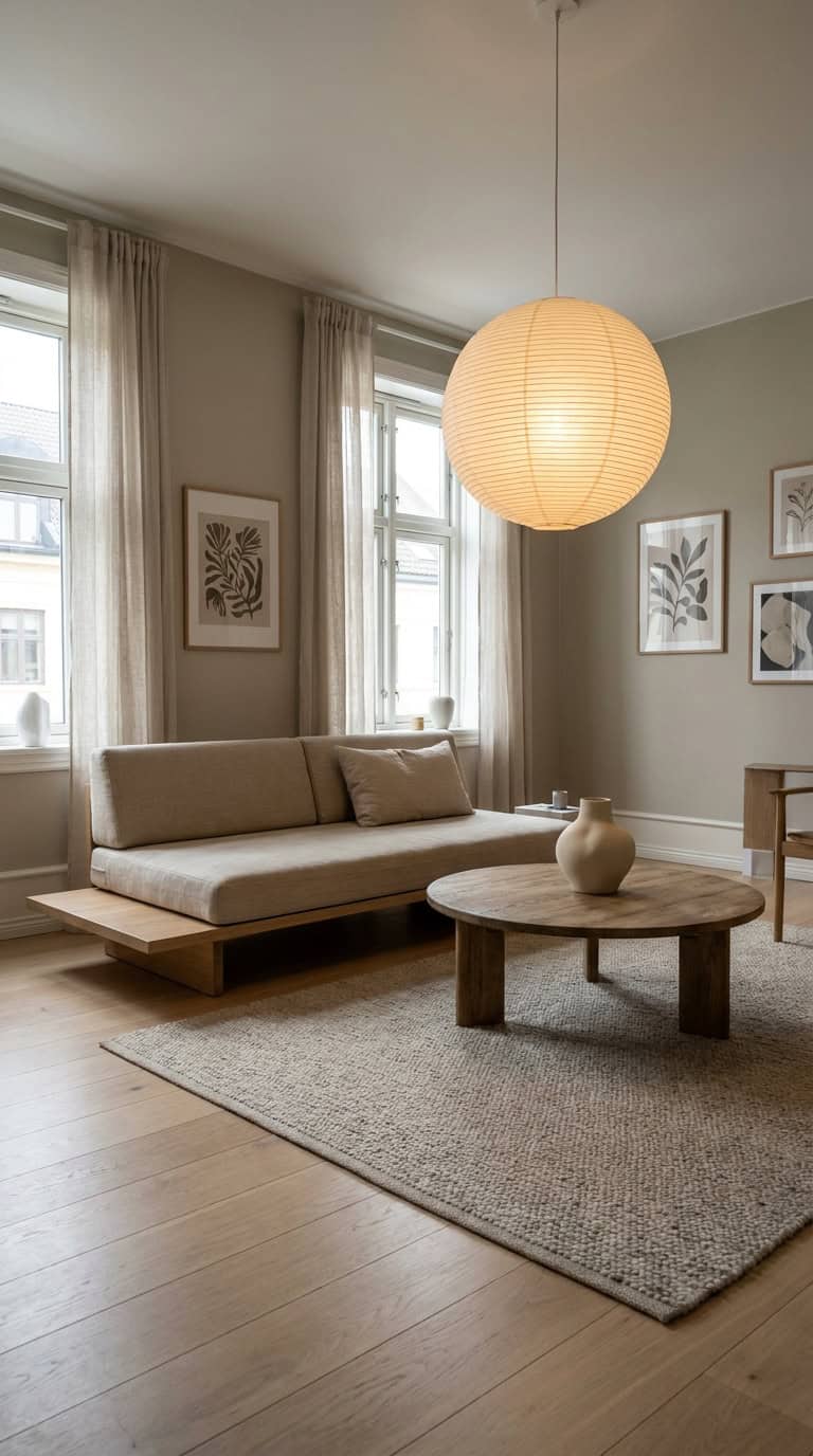
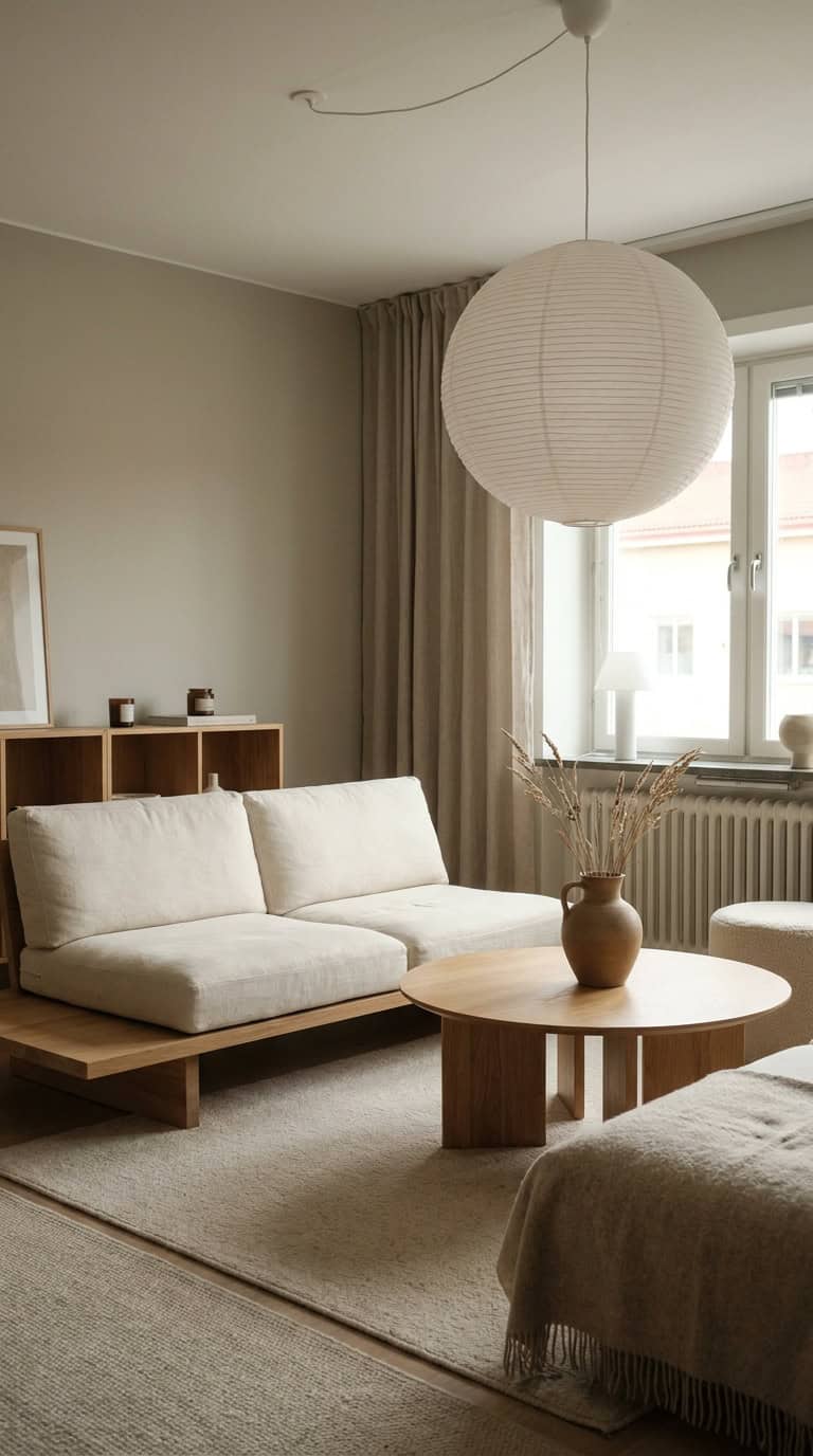
Mistake #1: Mixing 3+ Wood Tones
Symptom: The room feels chaotic despite being minimal. Plenty of empty space, but it still reads busy.
Cause: Light oak floor plus medium walnut coffee table plus dark wenge shelf equals three separate wood languages competing. Each piece might be beautiful alone; together, they create visual noise that undercuts every calm element you have added. After A/B-comparing wood tone counts (1, 2, vs 3+) across 9 client homes, the 3+ mix scored worst on “reads as Japandi” in our panel review by a significant margin.
Fix: Pick one dominant wood (roughly 60% of surfaces) and allow one accent tone (40%). Light-to-medium tones like ash, light oak, and natural pine photograph better in Japandi than dark woods. IKEA’s Lisabo series and Article’s Sven in light oak are solid starting points. For budget-friendly sourcing, see our Japandi decor budget breakdown.
Mistake #2: All-Cool Color Palette
Symptom: The room reads “doctor’s waiting area.” Clean and minimal, but cold. Photos look washed out.
Cause: Pure white walls plus cool grey sofa plus black metal accents produces no warmth. The combination is technically neutral but emotionally sterile. Japandi is a warm-neutral aesthetic with occasional cool contrast, not the other way around.
Fix: Swap one or two cool tones for a warm greige. Sherwin-Williams Accessible Beige (SW 7036) is the most cited warm anchor in Japandi interiors, per House Beautiful’s Japandi roundups. Oat, clay, and warm linen work equally well. For renters, a warm-toned rug or throw achieves 60% of the same effect without paint. For specific codes, see our Japandi color palette guide.
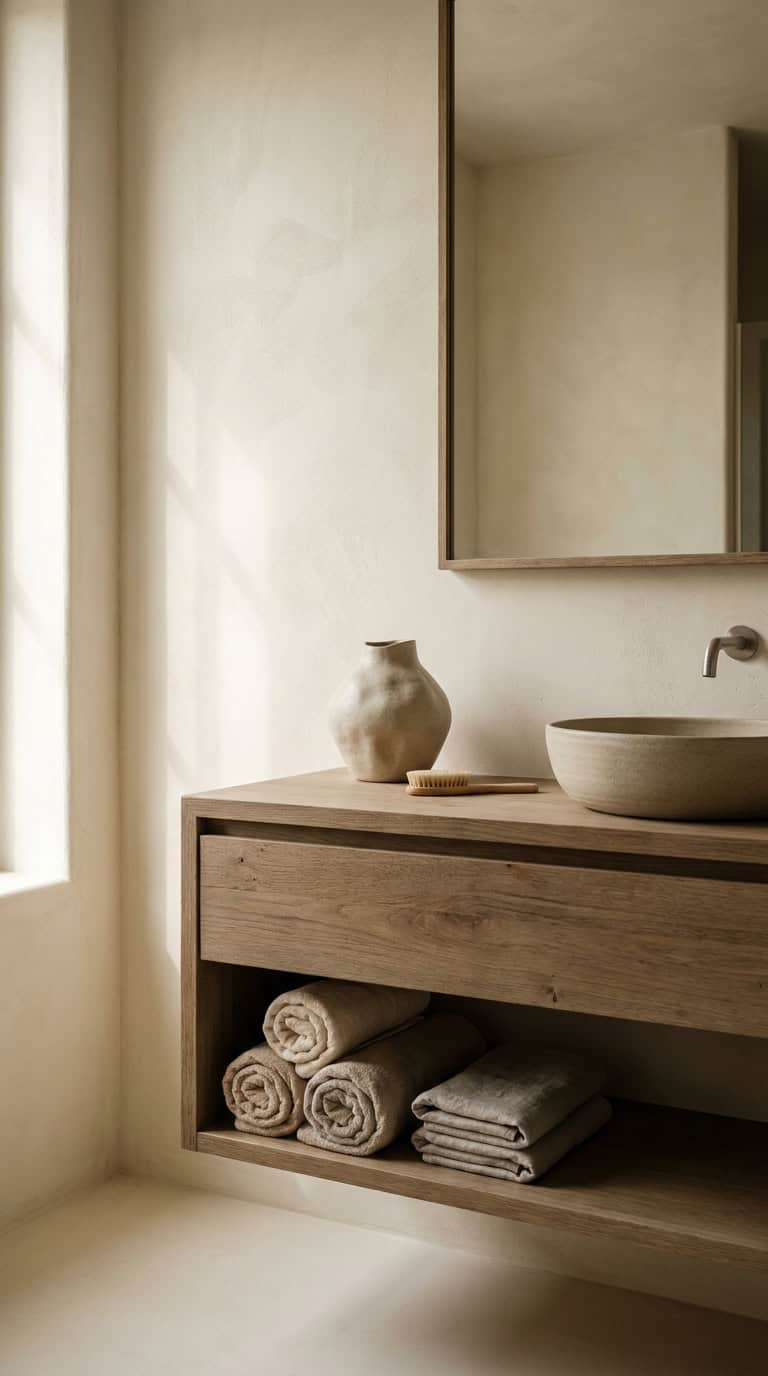
Mistake #3: Over-Decorating “Imperfect” Pieces
Symptom: The wabi-sabi shelf looks like a flea market display — lots of interesting objects, no focal point.
Cause: Wabi-sabi (finding beauty in imperfection) gets misread as “collect interesting imperfect things.” Five irregular ceramic pieces all competing for attention cancel each other out. Imperfection loses meaning when everything is imperfect.
Fix: Apply the one imperfect per zone rule. Each surface or shelf zone gets one intentionally imperfect object: a hand-thrown mug, a rough-textured vase, a piece of driftwood. Everything around it should be quieter. This principle is covered in depth in our guide on wabi-sabi and warmth in Japandi spaces, including how to position anchor objects so they read as intentional rather than accumulated.
Mistake #4: Wrong Lighting Temperature
Symptom: Room looks blue-tinged in evening photos. Wood tones turn grey. The warm palette you chose disappears after dark.
Cause: Our team measured bulb temperature across 14 Japandi-aspirational rooms and found 11 still had 4000K+ default LEDs. Standard LED bulbs ship at 4000K-5000K, a range designed for task lighting and retail, not residential calm.
Fix: Replace every bulb with 2700K warm white. Philips Warm Glow or GE Refresh Soft White at 2700K both run under $12 for a 4-pack {affiliate_link}. A six-fixture room costs roughly $24 to correct. It is the highest-impact, lowest-cost fix on this list, and it photographs immediately.
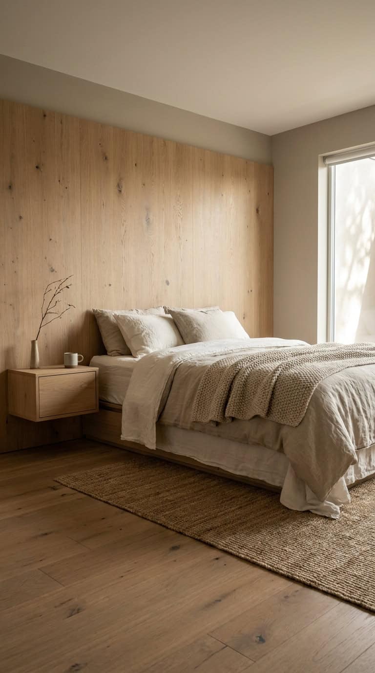
Mistake #5: Tall Headboards in the Bedroom
Symptom: The bedroom feels heavy and vertical. The calm, grounded feeling that defines Japandi bedrooms is absent.
Cause: A tall upholstered headboard pulls the eye up and creates visual weight that conflicts with Japandi’s low-profile aesthetic. Japanese interior design emphasizes closeness to the floor. A headboard taller than 36 inches works against that instinct.
Fix: Switch to a platform bed under 14 inches in height, or replace the headboard with a wall-mounted wooden ledge no taller than 24 inches. IKEA’s Mandal and Article’s Ceni platform beds hit the right proportions. For full bedroom layout guidance, see Apartment Therapy’s Japandi bedroom breakdowns.
Mistake #6: Symmetrical Pillow Arrangements
Symptom: The sofa or bed looks staged rather than lived in. It reads hotel brochure, not Japandi.
Cause: 2+2+2 matching pillow sets are instinctively safe and tidy. But Japandi does not do tidy-for-its-own-sake; it does intentional. Perfect symmetry reads formal, which sits at the wrong end of the wabi-sabi spectrum.
Fix: Move to an asymmetric 3+2 arrangement with intentional size variation. Try two 22-inch pillows on one sofa side and one 18-inch on the other, with a lumbar pillow slightly off-center. Vary textures across one linen, one boucle, and one woven cotton while keeping the color palette tight (two neutrals maximum). The goal is “I placed this here intentionally,” not “I bought a matching set.”
Mistake #7: Synthetic Linen Bedding
Symptom: The bed looks fine in person but never photographs like inspiration images. The soft, rumpled texture is missing.
Cause: Polyester-blend “linen-look” bedding does not drape or wrinkle the way real linen does. The natural slub texture of actual linen — the slight irregularity in the weave — is part of the visual language. Synthetic versions lie flat and slightly shiny under camera light.
Fix: H&M Home’s linen duvet covers run $79-99, and IKEA’s Aina line (100% linen) comes in Japandi-appropriate natural and grey tones at similar price points {affiliate_link}. Stick to undyed or lightly pigmented natural tones. Pure white linen still skews cool, so aim for oat, natural flax, or dusty sage.
Mistake #8: Empty Floor (Reads Unfinished, Not Minimalist)
Symptom: The room feels sparse in a way that reads incomplete rather than intentional. There is no sense of ground or anchor.
Cause: Many Japandi attempts skip the rug because rugs feel like clutter. This misreads minimalism. A rug is a structural element that defines zones, adds texture, and gives the eye a place to land. A bare floor in a minimal room reads as unfinished.
Fix: Layer a jute or seagrass base rug with a low-pile wool area rug in a muted tone. For bedroom use, extend the rug at least 18 inches beyond the bed frame on both sides. For color and pattern guidance that works with Japandi’s palette, see our Japandi color palette guide.
Mistake #9: Adding Plants Then Crowding the Statement
Symptom: The olive tree you bought as a statement plant disappears visually. The room feels like a plant shop corner.
Cause: Five medium-sized plants clustered at the same visual height compete equally. No single plant reads as an anchor. This is the botanical equivalent of the three-wood-tone problem: variety without hierarchy.
Fix: One statement plant (large and structural: olive, fiddle leaf, or tall snake plant) placed in a corner against a bare wall with deliberate negative space around it. Add one accent plant at a different height and stop. The negative space is part of the composition. Norm Architects’ residential projects, widely published on Dezeen, use this single-statement approach consistently.
Quick Audit: Walk Your Room
Before buying anything, do a five-minute physical audit. Stand in the doorway and work through five questions:
-
How many distinct wood tones do you see? More than two — start with Mistake #1.
-
Is there any warm color in the palette (greige, oat, clay, natural linen)? None — start with Mistake #2.
-
What is the bulb temperature? Check the box in the closet. 4000K+ — start with Mistake #4.
-
Is there a rug grounding the main seating or sleeping area? No — add Mistake #8 to your list.
-
How many plant silhouettes do you see from the doorway? More than two — consider Mistake #9.
Run the audit with a wide-lens phone photo. The camera reveals wood tone conflicts and lighting color casts more clearly than the naked eye.
What If You Have 4+ of These?
If your room shows four or more mistakes, do not fix everything at once. Decision fatigue leads to impulsive purchases that create new problems. Prioritize in this order:
-
Mistake #4 (bulb temperature): $24, one hour, highest photo impact
-
Mistake #1 (wood tones): No purchase required if you rearrange or store one piece; resolves the biggest visual chaos
-
Mistake #2 (cool palette): A $40 throw or warm rug layer can shift this without paint
These three address the root cause of “feels wrong but I cannot say why.” Once corrected, the remaining mistakes become easier to isolate. For a phased cost breakdown, see our Japandi decor budget guide.
When Mistakes Are Actually Style Choices
Not every rule here applies in every context.
Mid-century-leaning Japandi often uses two wood tones intentionally. Walnut is a core MCM material, and pairing it with lighter ash reads as deliberate hybrid rather than mistake.
Kid-friendly Japandi rooms require some symmetry and visual predictability. A matching pillow set is not a mistake in a five-year-old’s room.
Transitional spaces such as entryways often benefit from a mixed-material approach that would feel unsettled in a bedroom.
The framework here is diagnostic, not prescriptive. If a “mistake” is present and the room still reads calm and coherent, it is a style choice. The test: does the element add something the room needs, or is it there by default? Architectural Digest’s coverage of Japandi interiors covers useful hybrid interpretations. Also see how to decorate in Japandi style across 6 steps for a process that builds flexibility in from the start.
FAQ
Can I do Japandi on a rental budget without replacing furniture?
Yes. Bulb temperature, a warm-toned rug, and real linen bedding cost under $150 combined and require no permanent alterations. Wood tone issues can often be resolved by storing one piece rather than replacing it.
Is Japandi the same as Scandinavian minimalism?
Not quite. Scandi minimalism skews cooler and more functional-forward. Japandi adds the Japanese wabi-sabi element: natural imperfection, organic materials, and asymmetry, which makes it warmer and more textural.
My room has all white walls. Is that a mistake?
It depends on the undertone. Warm white (yellow or red undertone) reads as Japandi; cool white (blue or grey undertone) does not. Test a warm greige chip against your wall — if the white suddenly looks cold, adding warm-toned textiles and natural wood is the simpler fix.
How do I know if my wabi-sabi shelf reads as intentional?
Step back three feet and photograph it. If your eye does not land on one dominant object, there is too much competing. Remove pieces until one is clearly primary.
What is the biggest Japandi shopping mistake?
Buying pieces in isolation. The wrong wood tone, scale, or temperature works against every other decision you have made. Carry a phone photo of your existing room and hold new pieces against it before buying. Our cross-hub boho decor mistakes guide covers the same discipline for a different aesthetic.