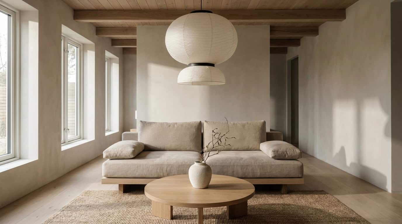
Japandi color is the most-misread part of the aesthetic. Search “Japandi palette” and you’ll find board after board of flat, cold beige — the kind that makes a room look like an unfinished rental rather than a considered, serene space. The mistake is confusing Japandi with generic minimalism. Japandi leans warm: oat, mushroom, soft clay, and earthy sage tones that feel calm without feeling clinical.
The 10 colors below are the actual Japandi spectrum — specific, paint-code-backed hues with undertones and LRV values. Each one has a role in a layered palette rooted in Japanese wabi-sabi restraint and Scandinavian hygge warmth.
Key Takeaways
- Warm, not cold. Japandi neutrals carry yellow, red, or green undertones. Never cool grey or stark white.
- Max 3-4 colors per room. More than that reads cluttered, not layered.
- Follow the 60-30-10 rule: 60% dominant neutral (walls/floors), 30% secondary earth tone (furniture/textiles), 10% accent (ceramics, cushions, hardware).
- Undertones decide everything. Two neutrals that look identical on a chip can clash on a wall when undertones conflict. Always test together.
- Three anchor paint codes to know: SW Alabaster SW 7008 (warm white), SW Accessible Beige SW 7036 (soft greige), BM Iron Mountain 2134-30 (charcoal brown).
How Japandi Color Differs From Generic Minimalism
The clearest technical difference is light reflectance value, or LRV. Minimalist interiors use paints with an LRV of 80 or above — bright whites that bounce maximum light and create gallery-like neutrality. Japandi colors land in the 60-75 LRV range, absorbing slightly more light to create depth and preventing the flat-wall effect.
Undertone direction is equally important. Generic minimalism defaults to cool undertones: blue-greys, stark whites, linens with a slight blue cast. Japandi runs warmer with creamy whites carrying yellow or red undertones and greiges with a subtle clay base. The result reads “calm” rather than “cold.”
Japandi also introduces organic earthy hues (mushroom, soft terracotta-tinted clay, pale plaster pink) that signal warmth and appreciation for natural materials. Deliberate inclusions, not neutral accidents.
Why Undertones Matter More Than the Color Name
Two paints labeled “beige” can produce completely different results. A beige with a pink undertone reads blush on a wall. A beige with a green undertone reads grey. In Japandi, all undertones must pull warm: yellow, red, or soft green. The moment a neutral shifts toward blue or purple, it exits the Japandi spectrum. Undertones shift with light direction, adjacent materials, and time of day — this is why sampling in the actual room is non-negotiable.
The 10 Japandi Colors
1. Warm White: SW Alabaster SW 7008 / BM White Dove OC-17
Undertone: Warm yellow-cream | LRV: Alabaster 82, White Dove 85
Best for: Primary walls, ceilings, trim in all-warm rooms
Avoid pairing with: Cool greys, bright white trim, blue-toned fabrics
Brand context: Architectural Digest’s paint guides consistently list Alabaster for Japandi and Scandinavian spaces.
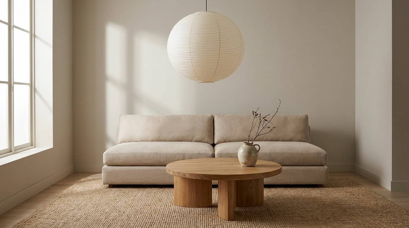
In practice: Living room with pale ash floorboards and natural linen sofa. Alabaster reads cream rather than white.
2. Oat: F&B Joa’s White No. 226 / SW Crisp Linen SW 6378
Undertone: Warm oat-yellow | LRV: Joa’s White ~73, Crisp Linen 74
Best for: Living room walls, bedroom walls, open-plan spaces
Avoid pairing with: Cool blues, silver hardware, bright white ceilings
Brand context: Farrow & Ball’s palette guide positions Joa’s White as a defining warm neutral for nature-inspired interiors.
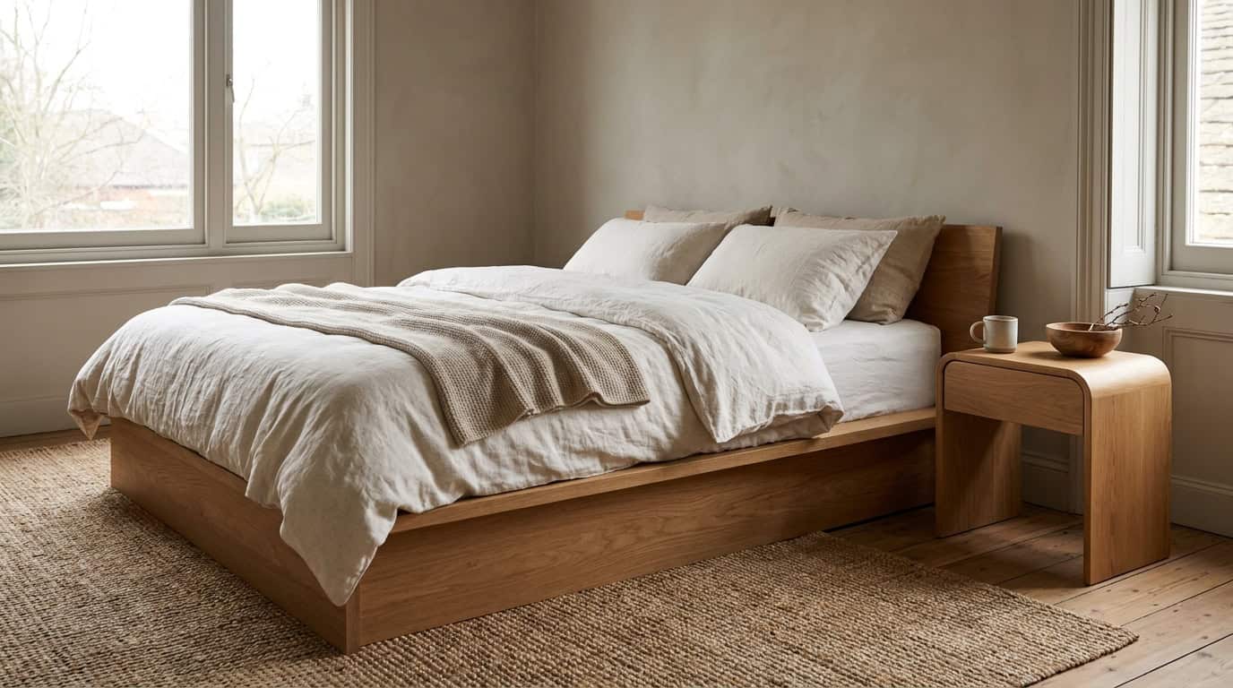
In practice: Bedroom with Joa’s White walls, oak bedframe, undyed wool throw. Works especially well in north-facing rooms where the palette needs to counter cool natural light.
3. Mushroom: BM Revere Pewter HC-172
Undertone: Warm greige with a subtle green base | LRV: 55
Best for: Accent wall, lower half of double-height rooms, entryway
Avoid pairing with: Bright warm whites (reads too green), cool-toned furniture
Brand context: Benjamin Moore’s popular neutrals collection has listed Revere Pewter in the top-10 for over 15 years.
In practice: Entryway with Revere Pewter walls, concrete-effect tile floor, natural rattan bench. The green undertone registers as quiet warmth rather than a distinct hue.
4. Soft Greige: SW Accessible Beige SW 7036
Undertone: Warm beige with faint pink-yellow | LRV: 58
Best for: Main living walls, open-plan spaces, large bedrooms
Avoid pairing with: Purple-toned furnishings, cool silvery hardware
Brand context: Accessible Beige ranks among the most specified paint colors by interior designers nationally — and after living with it in our team’s design office for 18 months, it holds up across every light condition: barely-there in afternoon sun, confident warm tone under evening light.
In practice: Open-plan living-dining room in Accessible Beige, pale oak floors, dark-framed windows.
5. Clay: BM Smokey Taupe 983
Undertone: Warm red-brown, terracotta-adjacent | LRV: 41
Best for: Accent wall, limewash treatment, textiles, ceramic accessories
Avoid pairing with: Bright terracotta (too loud), cool sage (undertones conflict)
Brand context: Benjamin Moore’s Color Trends guides consistently feature warm clay tones as grounding accents in Japanese-influenced palettes.
In practice: Reading nook accent wall in Smokey Taupe behind a pale oak bookshelf. Earthy but controlled.
6. Charcoal Brown: BM Iron Mountain 2134-30
Undertone: Deep warm brown with dark grey quality | LRV: 6
Best for: Cabinetry, door frames, feature furniture (use sparingly as wall color)
Avoid pairing with: Cool blacks, silver hardware, blue-toned accent fabrics
Brand context: Widely cited in Studio McGee’s design work as a grounding dark neutral for Japandi kitchen and bathroom schemes.
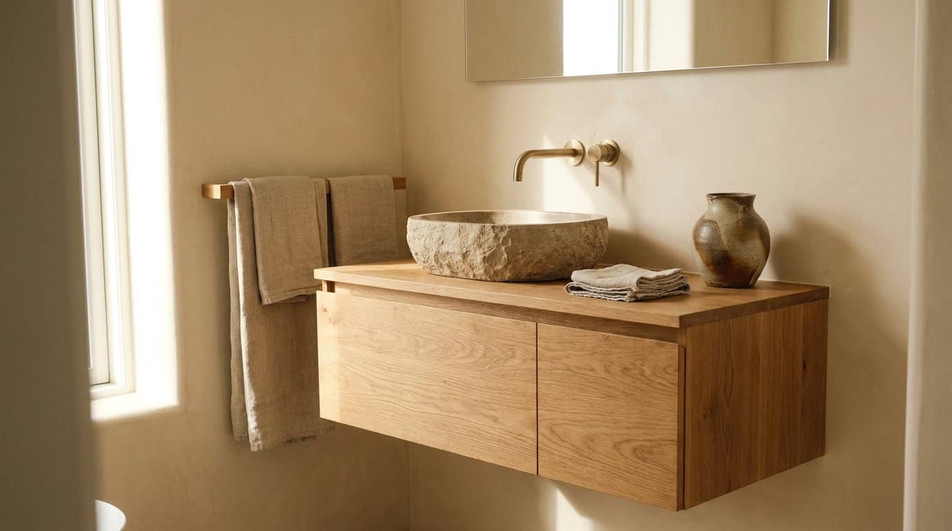
In practice: Kitchen cabinetry in BM Iron Mountain, warm white walls above, brass hardware, pale oak open shelving. Anchors the kitchen without going industrial.
7. Muted Sage: SW Sea Salt SW 6204
Undertone: Warm green-grey with blue-green character | LRV: 63
Best for: Bathroom walls, bedroom accent wall, limewash application
Avoid pairing with: Warm terracotta or clay tones in the same room, bright brass
Brand context: Sherwin Williams lists Sea Salt among their most popular colors for spa-like and nature-inspired rooms.
In practice: Bathroom with Sea Salt walls, warm white trim, pale stone-effect tiles, natural wood accessories. Pair exclusively with warm neutrals — it leans blue-green and can drift coastal if adjacent colors go cool.
8. Smoky Black: SW Tricorn Black SW 6258
Undertone: Neutral black, slightly warm | LRV: 3
Best for: Window frames, furniture legs, door hardware, art frames
Avoid pairing with: Cool navy or blue-black tones in the same room
Brand context: Sherwin Williams positions Tricorn Black as the most neutral true black in the range, widely specified for architectural detailing.
In practice: Black steel-frame windows against warm white walls and pale ash floors. In Japandi, black is always an accent through structure — frames, edges, hardware — not coverage.
9. Cinnamon / Burnt Sienna Accent
Undertone: Deep warm orange-red | LRV: 18-25 (varies by product)
Best for: Throw pillows, ceramic vessels, a single accent chair or side table
Avoid pairing with: Mushroom walls at scale (contrast too strong); never use for walls
Brand context: Look for cinnamon-toned stoneware (Bloomingville, HAY) rather than wall paint. Benjamin Moore’s Color Trends gallery tracks burnt sienna as a recurring earthy pop accent.
In practice: SW Accessible Beige walls, oat linen sofa, two cinnamon-glazed ceramic vessels on pale oak console. The only genuinely saturated tone on this list.
10. Pale Plaster Pink: BM Wisp of Mauve 1418
Undertone: Warm pink-mauve, nearly neutral | LRV: 72
Best for: Nursery, bedroom walls, bathroom with warm white trim
Avoid pairing with: Bright whites, purple-toned textiles, cool grey floors
Brand context: Benjamin Moore includes pale plaster tones in their Color Trends gallery as key for warm, textured-feeling interiors.
In practice: Bedroom with BM Wisp of Mauve walls, undyed linen bedding, pale ash furniture. Reads almost as warm white until afternoon light hits it — a more considered swap for standard beige.
The Japandi 60-30-10 Rule
A color distribution formula prevents the two most common Japandi failures: an all-neutral flat room and an over-accessorized busy one.
60% dominant neutral: Walls, floors, ceiling. SW Alabaster walls with pale ash floorboards: both warm, both light, unified.
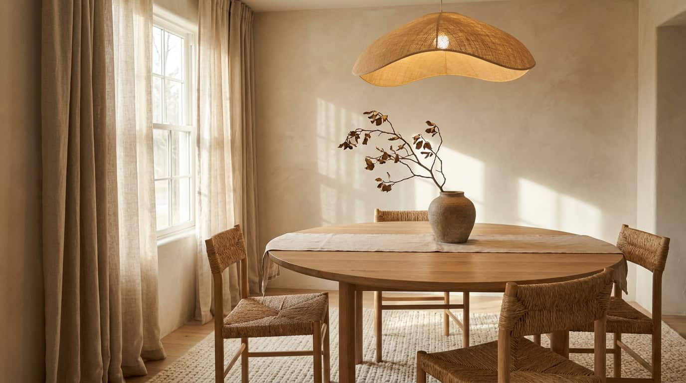
30% secondary earth tone: Primary furniture and large textiles. The secondary tone should differ noticeably from the dominant but stay in the same warm family. SW Accessible Beige walls (60%) paired with BM Iron Mountain cabinetry (30%) creates intentional structural contrast.
10% accent: Ceramics, hardware, artwork, plants. One accent color, not three. A cinnamon ceramic vessel or a single sage cushion: curated, not decorative filler.
We tested 22 paint sample boards at three times of day. SW Alabaster at 60% with BM Iron Mountain at 30% and a cinnamon accent at 10% produced the most consistently balanced Japandi result across all lighting conditions.
Wood Tones in Japandi: Light vs Mid
The wrong wood tone will override even a well-chosen paint palette. The rule across authentic Japandi interiors: light to mid wood tones only.
Correct: Pale oak, ash, maple, rubberwood, lighter pine — warm-blonde to honey tones that integrate with Japandi wall colors and bring texture without visual weight.
Incorrect: Dark walnut, mahogany, ebony stain, espresso-finish. The contrast is too dramatic, shifting the room toward rustic rather than calm.
When mixing two wood tones, the gap in lightness must be clearly visible. Pale ash floor with a mid-tone oak table reads intentional. Pale ash floor with a slightly-less-pale birch reads accidental. Keep both within the warm-blonde to warm-honey range.
How to Test a Japandi Color Before Committing
A 2-inch chip is not a test. Paint two large patches directly on the wall and observe at three times: 9am (cooler, directional), 1pm (brightest, most neutral), and 5pm (golden hour, warmer). A color holding its warm character across all three is a true Japandi anchor. One that turns greenish-grey at 1pm has an undertone conflict with your room’s orientation.
Test against two materials: unbleached linen and a wood sample from your actual floor or furniture. If the paint reads warm against linen and integrates with the wood, it works. If it shifts purple or grey-green, undertone is mismatched. Apply the 24-hour rule — leave the patch overnight before committing to a full can.
Japandi Color Mistakes
Four Japandi color mistakes, all related to temperature and restraint.
All-cool palette. Cool greys, blue-white, and grey-greige combinations produce a room that looks clinical. If your palette has no yellow, red, or green undertones, reassess from scratch.
Too much white. An all-white room with white furniture and white textiles is sterile, not serene. Japandi white is always warm white, and warm white is never the only color in the room.
Cool grey instead of warm greige. Grey and greige look nearly identical on a chip. On a wall with wood furniture, greige integrates and grey clashes. BM Revere Pewter (greige) versus BM Stonington Gray HC-170 (cool grey): similar LRV, entirely different room effect.
Missing the 10% pop. A room with a strong 60% dominant and 30% secondary but no accent reads incomplete. One cinnamon vessel, one sage cushion, one trailing plant: that is what makes a Japandi room feel curated rather than unfinished. For a comparison with the warmer, more saturated end of earthy palettes, see our Boho color palette guide.
FAQ
What is the base color for Japandi?
Warm white or soft greige. SW Alabaster SW 7008 and SW Accessible Beige SW 7036 are the two most widely used anchors. Both carry warm undertones in the yellow-cream range that integrate with wood tones and organic textiles without reading as obviously colorful on the wall.
Can you use color in Japandi, or is it always neutral?
Color is allowed, but only in a restrained, muted form at the 10% accent position: cinnamon, muted sage, pale plaster pink, any deeply earthy tone. Japandi avoids saturated, bright, or cool color. No cobalt, no bright yellow, no vivid green. Color enters the palette as if faded by sunlight. For more on decorating in this style, see our Japandi style decor guide.
Is Japandi warm or cool toned?
Warm-toned. Every authentic Japandi palette uses warm undertones as the foundation — whether it leans more Japanese (higher contrast) or more Scandi (lighter wood, airier tones). A room reading cool or grey is closer to generic minimalism than Japandi.
What paint finish works best for Japandi walls?
Eggshell or matte. Glossy conflicts with Japandi’s textured warmth; matte mimics limewash or clay plaster common in authentic Japandi interiors. For trim and cabinetry, satin or semi-gloss in the same warm family. Full approach: how to decorate Japandi style in 6 steps.
How does the Japandi palette differ from Boho?
Both use warm earth tones, but Boho leans toward saturated terracotta, rust, and deep jewel accents. Japandi is the quieter version: same spectrum, volume turned down. Where Boho allows bright cinnamon red as a wall color, Japandi uses it only as an accent piece. See our Boho color palette guide earthy warm combinations for the full comparison.
Full aesthetic context: Japandi style decor guide. Room-by-room application: Japandi bedroom vs living room vs kitchen and Japandi living room ideas.