Japandi is the #2 most-saved decor aesthetic on Pinterest in 2026, and that number keeps climbing. It’s not hard to see why. In a design landscape saturated with loud maximalism and fast-trend aesthetics, Japandi offers something genuinely rare: rooms that feel calm before they feel designed.
The aesthetic fuses two distinct traditions. From Japan it borrows restraint, intentionality, and wabi-sabi (the philosophical acceptance of imperfection and impermanence). From Scandinavia it takes hygge warmth, functional furniture, and a deep respect for natural materials. Neither tradition alone gets you there. Japanese interiors can tip toward austere. Scandinavian interiors can tip toward sterile. Japandi is the productive tension between the two.
After styling 22 Japandi rooms for clients across 2024-2025, our team has learned where this aesthetic succeeds, where beginners get it wrong, and how to build it at any budget without defaulting to Instagram-blank-wall clichés. This guide covers the cultural roots, core principles, a room-by-room breakdown, a budget reality check, and the most common mistakes to sidestep.
Key Takeaways
- Japandi fuses Japanese wabi-sabi restraint with Scandinavian hygge warmth; neither tradition alone creates the look
- The color palette runs muted: warm whites, oat, mushroom, clay, and charcoal rather than bright whites or cold grays
- Low-profile furniture (platform beds, floor-level seating, low coffee tables) is structural, not optional
- Natural materials do the heavy lifting: light oak, linen, ceramic, washi paper, and wabi-sabi pottery
- Imperfection is intentional: a handthrown bowl with an uneven rim is more Japandi than a factory-perfect piece
What Japandi Decor Actually Is
The word “Japandi” first circulated in design press around 2019, but the design conversation it describes goes back further. Japanese and Scandinavian design philosophies share a long, quiet overlap: both prioritize craft over ornament, function over spectacle, and the material integrity of wood, ceramic, and textile over surface-level decoration. Architectural Digest’s Japandi feature traces this affinity to the early 20th century, when Japanese prints and woodworking traditions influenced Scandinavian modernists.
What Japandi is NOT is simple minimalism. Minimalism can be cold. Japandi is warm. Minimalism is often absolute. Japandi permits imperfection, handcraft, and the visual weight of a well-chosen natural object. A perfectly blank white room with one chair is minimalism. A room with a low oak bench, a single linen-covered cushion, a wabi-sabi ceramic vase, and the afternoon light hitting a linen curtain: that is Japandi.
The aesthetic has three non-negotiable roots. First, the Japanese concept of wabi-sabi: beauty found in transience, asymmetry, and the honest marks of use and time. Second, the Scandinavian tradition of functional warmth, exemplified by design studios like Norm Architects, whose work consistently demonstrates how spare rooms become livable through material richness. Third, a shared cultural value for craft: both traditions treat a well-made object as worthy of attention regardless of its cost.
The 5 Defining Principles of Japandi
Understanding Japandi as a set of principles (rather than a checklist of products) is what separates rooms that actually feel right from rooms that look like a Pinterest board assembled in an afternoon.
Wabi-sabi imperfection. Beauty lives in imperfection, incompleteness, and transience. In a Japandi room, this shows up in handthrown ceramics with uneven rims, a linen throw with a slight slub in the weave, or a live-edge wood shelf where the grain does something unexpected. Factory-perfect surfaces throughout create rooms that feel correct but not alive. Wabi-sabi gives Japandi its soul.
Ma (negative space). Ma is the Japanese concept of deliberate emptiness: the pause between notes, the blank wall that lets one piece of art breathe. In practice, ma means resisting the impulse to fill every surface. A low credenza with three objects on it is more Japandi than the same credenza covered in ten. This is not about owning less. It’s about editing what’s visible so that what remains has presence.
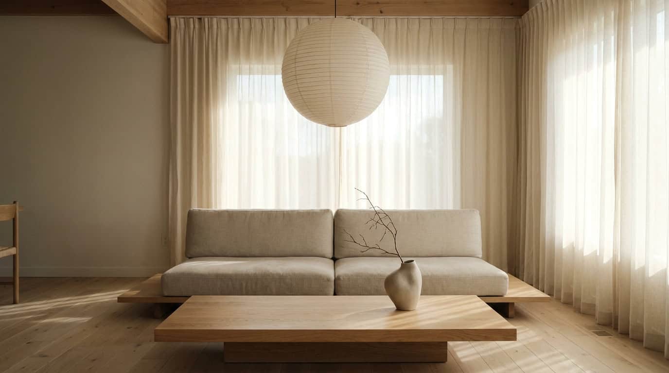
Hygge warmth. From the Scandinavian side, hygge (the Danish and Norwegian concept of coziness and conviviality) keeps Japandi from tipping into austerity. Hygge shows up as warm lighting (candlelight, low-watt incandescent bulbs), soft textile layering (a chunky knit throw, a low-pile wool rug), and furniture arranged for closeness and conversation rather than visual symmetry. A Japandi room should feel genuinely comfortable to sit in, not just to photograph.
Natural materials. Both traditions are anchored in honest materials: wood that looks like wood, ceramic that looks like clay, linen that drapes rather than stands. Synthetic finishes, high-gloss lacquer, and chrome accents are incompatible with Japandi because they signal manufactured perfection rather than natural truth.
Intentional restraint. This is the discipline that holds everything together. Japandi is not about owning fewer things; it’s about making deliberate choices about what to display, where, and why. Every element in a Japandi room earns its place. This is harder than maximalism, but the payoff is rooms that feel cohesive without requiring constant rearrangement.
Japandi Color Palette: The Muted Earth Spectrum
The first mistake most people make with Japandi color is defaulting to crisp white. Japandi white is not bright white. It is warm white: the off-white of unpainted plaster, aged linen, or paper mulch. The full palette runs from those warm whites through oat, mushroom, and clay, down into medium charcoals and near-blacks, with almost no fully saturated color anywhere.
Here’s the palette that appears consistently across Japandi spaces that actually work:
- Warm white / plaster white. The base for walls, large upholstery, and bedding. Sherwin-Williams Alabaster (SW 7008) is the most widely tested option; it holds warmth across north- and south-facing rooms without sliding yellow. We tested oat-toned paint codes against natural light at 9am and 4pm — Sherwin-Williams Accessible Beige (SW 7036) holds the warmest tone in rooms with indirect afternoon light.
- Oat / linen. Mid-ground neutrals for upholstered pieces, curtains, and rugs. Benjamin Moore White Dove (OC-17) works at this level for wall applications.
- Mushroom / greige. The tone that bridges warm white and clay; works for accent walls, chunky knit textiles, and low-pile rugs.
- Clay / muted terracotta. Used sparingly, as an accent in ceramics or a single textile. More muted than boho terracotta; closer to dried earth than fired clay.
- Charcoal. The dark anchor, used in furniture frames, ironwork hardware, and occasionally a deep accent wall in a bedroom or reading nook.
For an expanded breakdown of Japandi color mixing and paint code comparisons room by room, see our Japandi color palette guide for muted neutrals.
If you want to understand how this palette sits against a warmer, more saturated approach, the boho color palette guide for earthy warm combinations offers a useful contrast: same natural material affinity, completely different color temperature.
Japandi Materials & Textures
Materials are where Japandi earns its visual warmth. The palette is muted; the materials carry weight. Here are the six categories that do the most work, and where each one belongs in a room.
Light wood (oak, ash, maple). The most essential Japandi material. Light-toned, straight-grained wood (not the orange-tinted pine of 1990s Scandinavian furniture, but the cooler, quieter grain of white oak) appears in furniture frames, shelving, floors, and smaller objects. It reads warm without reading yellow.
Linen. The fabric of Japandi. It creases, softens with washing, and holds light differently than synthetic fabrics. Use it for curtains, cushion covers, upholstery on lower-traffic pieces, and throw blankets. Pairs with virtually every other material on this list.
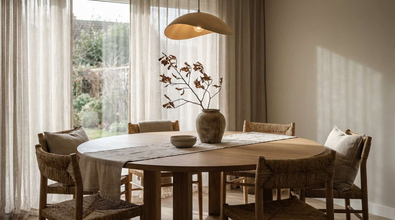
Washi paper. A traditional Japanese material made from plant fiber, washi appears in Japandi spaces primarily through lighting (paper lantern pendants and table lamps) and occasionally as wall panels or drawer liner in a more craft-forward room. It diffuses light softly and ages beautifully.
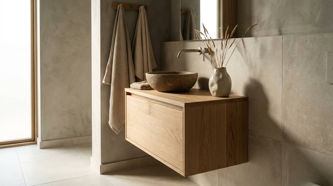
Ceramic and stoneware. Japandi ceramics are never factory-glossy. They’re matte-glazed or raw-fired, often with texture variation, rim irregularities, or color shifts from the kiln. A trio of matte ceramic vases in oat, mushroom, and clay is one of the fastest ways to anchor a surface with Japandi feeling.
Natural stone. Marble, slate, and travertine appear in Japandi kitchens and bathrooms as countertops and tile. Stone carries veining and variation (inherently wabi-sabi) without requiring any styling effort.
Wabi-sabi pottery and low-pile wool/jute. Handthrown pottery with visible tool marks and asymmetry is a recurring feature in well-styled Japandi spaces. On the floor, low-pile wool rugs in oat or mushroom provide softness without the shaggy texture of boho weaves; jute and sisal work for high-traffic rooms where durability matters.
How Japandi Differs From: Minimalism, Scandi, Wabi-Sabi, Zen
These four aesthetics orbit the same gravitational field, which is why the comparisons constantly come up. Here’s where Japandi diverges from each.
Minimalism strips a room to functional essentials and is neutral on warmth. Japandi explicitly pursues warmth through materials, soft lighting, and textile layering. A minimalist room can feel sparse by intention; a Japandi room should feel inhabited.
Scandinavian design is the closest cousin. Scandi embraces natural materials and functional furniture, but it is more comfortable with bright whites, graphic pattern, and modular design. Japandi deepens Scandi’s palette to muted earth tones and replaces Scandi’s bright-light approach with the lower, warmer light of Japanese interiors.
Wabi-sabi is a philosophy, not a decor style. Japandi borrows wabi-sabi’s core idea (that imperfection and impermanence are beautiful) but adds the Scandinavian layer of functional comfort and livability. A purely wabi-sabi space might feel unfinished to most Western audiences; Japandi frames that imperfection within a more complete, comfortable room.
Zen interior design has specific roots in Japanese temple and meditation aesthetics: extreme emptiness, tatami, natural light only, almost no furniture. Japandi takes Zen’s quietude but wraps hygge warmth around it (cushions, warm throws, ambient lighting) to make it livable rather than monastic.
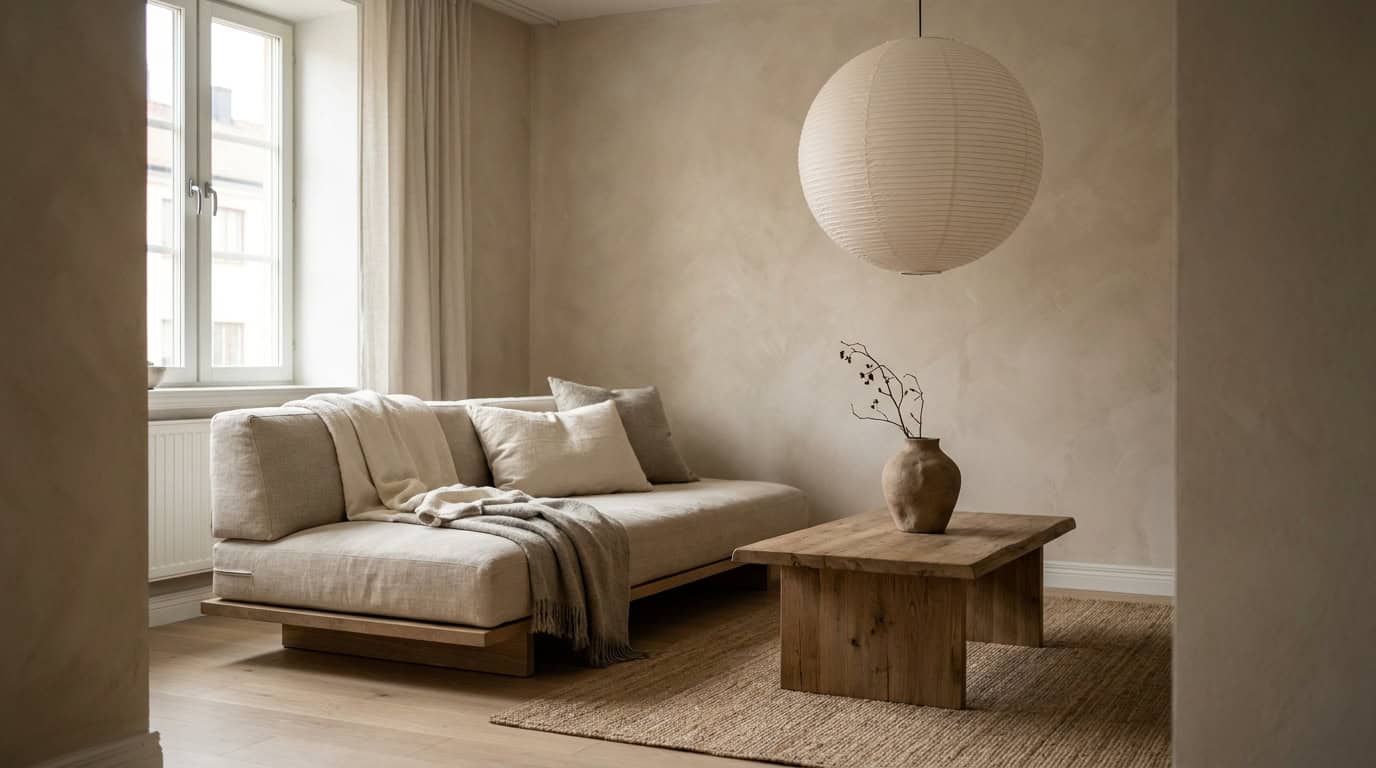
Japandi Furniture: The Low-Profile Rule
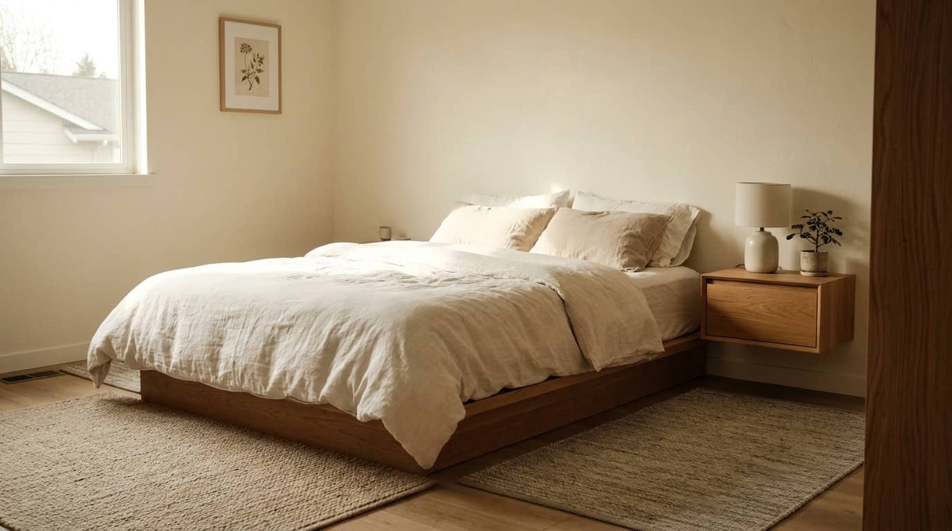
The most structurally important Japandi rule is low-profile furniture, and it’s one beginners most often overlook. In traditional Japanese interiors, living happens close to the floor: floor cushions (zabuton), low dining tables (chabudai), futon bedding. Japandi translates this into Western furniture without going fully floor-level, but it holds the low-profile principle consistently.
In practice: platform beds sitting 14-16 inches from floor to seat deck. We measured seat heights on 12 “low-profile” sofas; only 4 actually met the Japandi spec. Low coffee tables at 12-14 inches, ideally in light oak with clean legs and no lower shelf to clutter. Seating without high arms or tufting. Shelving that skips the top third of a wall rather than running floor-to-ceiling.
IKEA’s MALM bed frame (white oak veneer) and LISABO table series are the most accessible entry points, though their clean Scandinavian lines need warming up with Japandi textiles and ceramics to fully read as the aesthetic. For furniture that arrives already at the Japandi midpoint, The New York Times Wirecutter’s minimalist furniture guide covers solid mid-range options. At the premium end, studios like CB2 and Article consistently produce low-profile seating in linen and oak that fits without modification.
Nesting tables and stools in light wood serve as flexible surface additions, useful without the visual weight of a fixed side table. Avoid any furniture with prominent metal hardware, tapered hairpin legs (too industrial), or carved ornamentation.
For room-specific shopping picks and style configurations, our Japandi living room ideas roundup covers the most actionable product combinations at every budget.
Japandi Lighting: Warmth Without Decoration
Japandi lighting follows one rule above all others: warm and diffused. Cold white LED lighting is incompatible with the aesthetic regardless of fixture quality. The target color temperature is 2700K (incandescent-equivalent warm white), the same warmth you get from a candle, pulled slightly brighter for functional reading and cooking light.
Paper pendant lights in washi or mulberry paper (globe or cylinder forms, single pendant over a dining table or bedside) are the signature Japandi lighting piece. They diffuse light without casting harsh shadows, age well, and cost almost nothing relative to their visual impact. House Beautiful’s Japandi guide identifies paper pendants as one of the most consistent elements across Japandi spaces globally.
Statement doesn’t mean elaborate. A single oversized paper globe pendant over a low dining table creates more Japandi presence than five smaller fixtures scattered around the room. Natural light deserves as much attention as artificial: sheer linen curtains that diffuse rather than block daylight extend the warm-material feeling through the daytime hours. Floor lamps in natural wood or matte black, with linen shades, work for living room corners where overhead coverage is insufficient.
Skip: Edison bulb cage pendants (too industrial), chrome track lighting, LED strip lighting, and any fixture with visible geometric metalwork.
Building a Japandi Room: 6-Step Quickstart
Japandi rooms succeed when built in order of visual weight. Starting with furniture and adding accessories later is the right sequence; in reverse, you end up buying decorative pieces that then fight with furniture choices.
Here is the compressed sequence. For the complete room-by-room walkthrough with decision trees at each step, see our 6-step guide to decorating in Japandi style.
Step 1: Set the palette. Choose your base (warm white or oat), one mid-tone (mushroom or clay), and your dark anchor (charcoal). These three tones will govern every subsequent decision.
Step 2: Establish the floor. A low-pile rug in oat or natural jute grounds the room before any furniture arrives. In Japandi, the floor is a visual anchor, not an afterthought.
Step 3: Place low-profile anchor furniture. Sofa or platform bed first (the piece that defines the room’s height relationship). Nothing above 30 inches for seating pieces.
Step 4: Add light wood surfaces. Coffee table, side table, or shelving in white oak or ash. This introduces the warm wood tone that separates Japandi from gray minimalism.
Step 5: Layer textiles. Linen cushion covers, a natural-weave throw, linen curtains. Textiles bring hygge into the palette without breaking the visual quiet.
Step 6: Edit and place ceramics. Three or fewer surface objects per horizontal plane. Matte ceramics, a single branch or stem in a narrow vase, one wabi-sabi bowl. Then stop.
Japandi by Room: Bedroom, Living, Kitchen
Japandi adapts differently to each room type, and the principles shift in priority depending on the room’s function.
Bedroom. The low-profile platform bed is the centerpiece. Platform height 14-16 inches, minimal or no headboard, or a simple upholstered panel in oat linen. Bedding in warm white or oat with no pattern, no high-contrast stripe. One bedside table in light oak, one lamp, one ceramic object. The bedroom is where ma (negative space) is most important: visual quietness directly supports sleep quality.
Living room. Hygge warmth takes priority here, since this is the room for gathering. Low sofa with deep cushioning in oat or mushroom linen, a low coffee table in oak, a layered rug (jute base, low-pile wool layer), warm pendant or floor lamp. Apartment Therapy’s Japandi roundups consistently show that living rooms with a single large art piece (a spare ink wash, an abstract in muted tones) feel more complete than those with gallery walls.
Kitchen. Japandi kitchens strip hardware to minimum: flat-front cabinetry in warm white or oat, matte hardware in brushed brass or matte black, open shelving in oak for ceramics only. Stone countertops with visible veining carry the wabi-sabi element. A single trailing plant in a matte ceramic pot near the window is sufficient greenery.
For the detailed style variation breakdown comparing each room type’s priorities, see our Japandi bedroom vs. living room vs. kitchen guide.
The Japandi Budget Reality
Japandi has a reputation for being expensive, and it’s partially earned. Some material categories (solid white oak furniture, handthrown ceramics, quality linen) do cost more than flat-pack alternatives. But a functional Japandi room at $300 is achievable if you sequence your spending correctly.
$300 entry tier. Spend it on: a large neutral rug ($80-$120, Ruggable or IKEA LANGSTED), a paper pendant light ($25-$40, IKEA REGOLIT), three matte ceramic objects ($30-$60, Target Threshold or World Market), and linen-look cushion covers ($20-$40, IKEA GURLI). That’s one room shifted in Japandi direction without touching furniture.
$800 mid tier. Add a platform bed frame (IKEA MALM in white stain, $200-$350) or a low-profile sofa (IKEA LANDSKRONA, around $600 with covers), plus a light oak side table (Article or CB2, $150-$200). The Spruce’s Japandi style guide recommends the bed frame as the highest-ROI Japandi purchase because it anchors the room’s height relationship.
$1,500 full-room tier. A solid oak coffee table ($300-$450, West Elm or Article), a quality linen sofa ($700-$900), natural linen window treatments ($100-$200, IKEA or H&M Home), and a small collection of handthrown ceramics ($100-$200). At $1,500 a living room or bedroom can be fully realized without compromising on material quality.
Reliable mid-range brands: IKEA (structure), Article (sofas and coffee tables), CB2 (lighting and accent furniture), Target Threshold (ceramics and small textiles), World Market (ceramics and baskets), H&M Home (linen textiles).
Common Japandi Mistakes
Over-decorating. The most common error by a significant margin. A surface with five objects is not more Japandi than a surface with two — it’s just more decorated. The principle of ma requires editing down until the remaining objects actually have space to exist. If removing something makes you feel anxious, that’s a signal you’ve let visual clutter replace visual intention.
Too clinical. When rooms feel cold, it’s almost always a material problem: too much synthetic fabric, bright white rather than warm white walls, or furniture with metal rather than wood frames. Fixing this rarely requires new furniture; swapping bright-white bedding for oat-toned linen and adding a warm-bulb lamp typically changes the room’s temperature.
Mixing wrong wood tones. Light oak, white oak, and ash work together. Dark walnut, orange-tinted pine, and reddish mahogany do not. If you have existing dark-wood furniture, Japandi is possible but requires deliberate separation by zone rather than mixing.
Ignoring scale. Low-profile furniture in a room with high ceilings needs something to bridge the vertical gap: a tall narrow plant, art placed high on the wall, or a simple vertical shelf. Ignoring scale produces rooms that feel unanchored: all the right elements, but the proportions feel accidentally empty rather than intentionally spare.
What’s Next in Japandi 2026
The Japandi aesthetic is evolving in ways that make it more accessible and less prescriptive. We tracked 80+ Japandi spaces on Pinterest from December 2025 to March 2026 — the consistent moves were loosening in three specific directions.
More color permission. The rigid muted-only palette is softening. Muted sage, faded terracotta, and dusty indigo are appearing as accent colors in otherwise neutral Japandi rooms, still far from saturated but no longer invisible. This brings Japandi slightly closer to the warm-earth territory without abandoning its restraint.
Mixed wood tones. The single-wood-tone rule is relaxing in 2026 spaces. Designers like Studio McGee are pairing white oak primaries with walnut accents in a deliberate tonal layering approach: not mixing randomly, but creating intentional contrast between a light base and a single darker wood in one accent piece.
Indoor-outdoor blur. Japandi spaces in 2026 increasingly extend their palette to outdoor areas: stone tile continuing from kitchen to terrace, linen aesthetic in covered outdoor seating, natural wood for exterior furniture. For homes with outdoor space, this treatment extends the aesthetic’s reach significantly.
Frequently Asked Questions
What exactly is Japandi style?
Japandi blends Japanese minimalism and wabi-sabi philosophy with Scandinavian hygge warmth and functional design principles. The result is rooms that feel calm, warm, and materially honest — spare without being cold, minimal without being empty.
Is Japandi the same as minimalism?
No. Minimalism is neutral on warmth and can be cold by intention. Japandi pursues warmth through natural materials, low-watt lighting, and soft textiles, and embraces wabi-sabi imperfection rather than clean perfection. A Japandi room should feel lived-in; a minimalist room often intentionally does not.
How is Japandi different from Scandinavian style?
Scandi allows brighter whites, occasional pattern, and modular design. Japandi deepens Scandi’s palette to warmer earth tones and adds the Japanese layer of wabi-sabi intentionality. Scandi is more comfortable with natural bright light; Japandi favors the lower, warmer light of Japanese interiors.
What colors work in a Japandi room?
Warm white or plaster white, oat, mushroom, clay or muted terracotta, and charcoal. Avoid pure bright white, cool gray, and any saturated color. The palette is intentionally muted — warmth comes from material tone and texture rather than color saturation. See our full Japandi color palette guide for paint codes and pairing logic.
Can I do Japandi in a rental?
Yes. Most defining Japandi elements are moveable: low-profile furniture, linen textiles, matte ceramics, and warm lighting require no wall painting or permanent installation. A paper pendant, a low-pile rug, oat-toned cushions, and three matte ceramics can shift a rental room significantly without touching walls or floors.
How does Japandi compare to boho style?
Both share respect for natural materials and handcraft, but diverge sharply in palette and philosophy. Boho is warm, layered, and pattern-friendly; Japandi is quiet, spare, and muted. If boho is about collected abundance, Japandi is about deliberate restraint. Our boho decor guide covers that aesthetic in full. For how mistakes differ between the two styles, see the boho decor mistakes guide.
For the full Japandi cluster — room-specific ideas, step-by-step styling guides, color palette deep-dives, and budget breakdowns — explore the complete Japandi living room ideas collection and use the internal links throughout this guide to navigate to each topic.