DecorQuarter · budget decor
Mid-Century Modern Color Palette
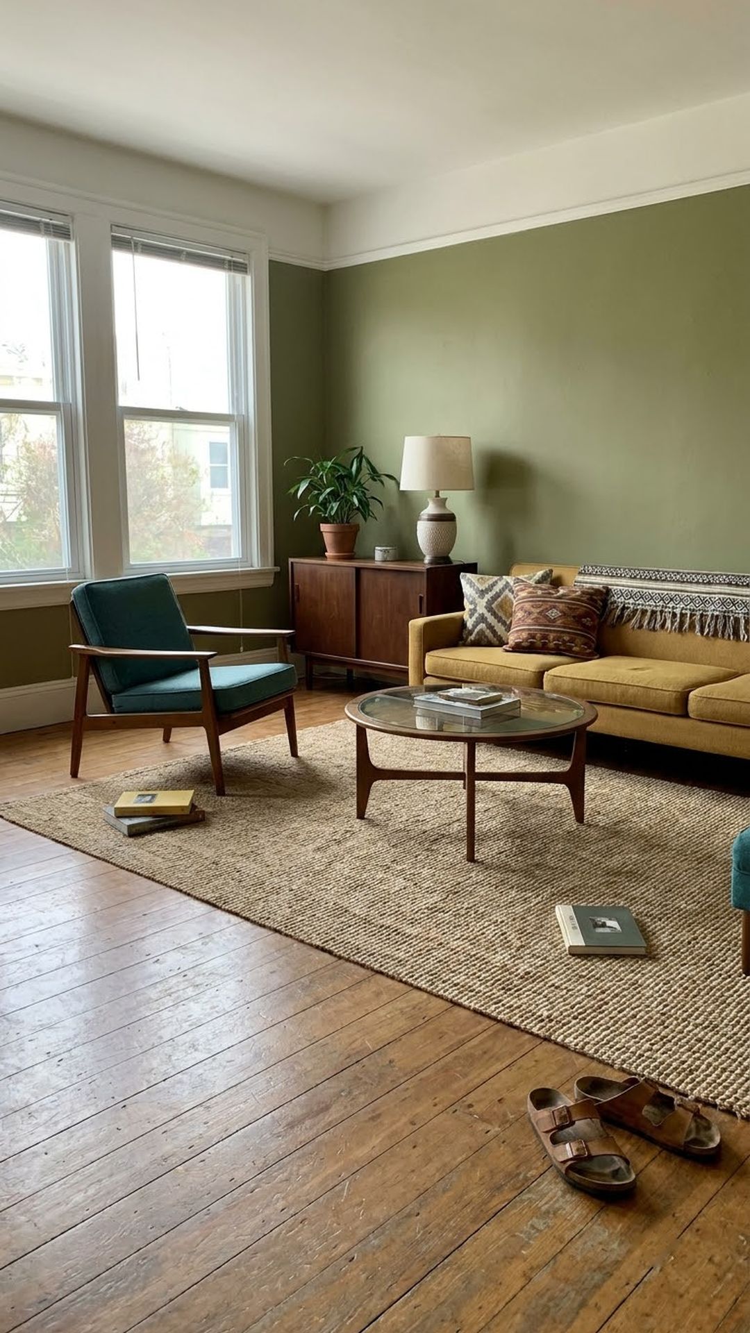
A true mid-century modern color palette runs on earth tones that breathe — warm ochres, tobacco browns, avocado greens — punctuated by sharp jewel-tone accents like teal, coral, or cobalt.
What Actually Separates MCM Color From Every Other Retro Palette?
Mid-century modern color is defined by three structural rules that its contemporaries didn’t share. Victorian rooms stacked competing saturated patterns. Art Deco leaned hard on black and metallic gold.
The 10 Period-Accurate MCM Color Combinations
Paint names are from major US brands; hex codes are for digital swatch reference. The “best room” suggestion reflects where the combination’s visual weight works best, though none are strictly limited to that space.
How to Apply Your Chosen Palette Room by Room (3 Steps)
Choosing a combination is the easy part. Distributing it correctly is what separates a polished MCM room from something that looks like a theme-park recreation.
Where to Buy: Paint Brands and Real Price Ranges
Paint quality matters more in MCM palettes than in most other styles.
Three MCM Color Mistakes That Age a Room Overnight
Even with the right combination, a handful of common errors push a room from “considered design” into “period costume.” Here’s what to watch for.
The Palette Is the Starting Point, Not the Finish Line
A great mid century modern color palette isn’t about cramming every retro hue into one room. It’s about choosing the right three, applying them in the right proportions, and letting the finish do the rest.
The full plan
Mid-Century Modern Color Palette
Every idea, with prices and where to buy it, is in the full guide.