DecorQuarter · budget decor
Boho Color Palette Guide
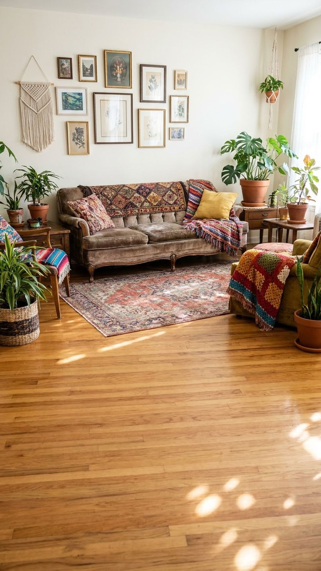
A boho color palette works when you layer 2-3 warm earthy base tones (terracotta, sage, rust, warm cream) with one saturated accent, keeping a warm neutral across at least 60% of the room.
What Makes a Color Palette Genuinely “Boho”?
A boho color palette isn’t random earthy chaos, it follows a specific logic. The foundation is always warm and grounded: think burned oranges, dusty pinks, clay reds, olive greens, and camel tans. These are pulled from desert landscapes, global textiles, and natural materials.
1. Terracotta + Warm White + Aged Brass
This is the most accessible boho starting point, and for good reason. Terracotta walls (or terracotta pillows against a warm white wall) read immediately as bohemian without feeling costumey. Paired with aged brass hardware and light wood tones, it’s warm without being heavy.
2. Sage Green + Cream + Warm Tan
Sage green has become one of the defining colors of modern boho, softer than olive, calmer than forest green, and incredibly easy to layer.
3. Rust + Mustard + Off-White
This is the warmest, most richly saturated palette on the list. Rust (a deep, muted orange-red) and mustard (golden yellow) are classic boho accent colors, found everywhere in Moroccan tiles, vintage kilim rugs, and Indian block-print textiles.
4. Dusty Pink + Warm Beige + Rattan Brown
Dusty (or muted) pink is having a serious moment in boho spaces, and it reads very differently from millennial pink. It’s softer, more terracotta-adjacent, and sits comfortably next to natural materials like rattan, bamboo, and linen.
5. Deep Indigo + Warm Camel + Natural Linen
Indigo is boho’s most dramatic option, pulled directly from indigo-dyed textiles and batik traditions across West Africa and Southeast Asia. It works because it’s not cold. Deep indigo has enough warmth and depth to anchor a layered space rather than contrast against it.
The full plan
Boho Color Palette Guide
Every idea, with prices and where to buy it, is in the full guide.