Boho is one of the most forgiving design styles out there, until it isn’t. We’ve spent months reviewing pinned rooms, styled apartments, and reader-submitted photos, and the same patterns keep coming up. These are small, easy-to-miss missteps that nudge a space from “curated and lived-in” to “someone dumped a HomeGoods cart in here.” The good news: every single one is fixable.
Key Takeaways
- Buying pre-packaged “boho sets” is the fastest way to make a room look fake
- Texture and visual interest need to be distributed at multiple heights, not just the floor
- One statement macrame piece works; five pieces cancel each other out
- Real or high-quality faux plants are non-negotiable for the boho vibe
- Pampas grass has passed its peak — there are better dried botanicals in 2026
- Boho and cool gray modern clash at the palette level; stick to earthy warms
- Clear surfaces are not minimalist in boho — they are breathing room
Mistake 1: Buying Full “Boho Sets” That Look Fake-Curated
This is the most common pattern we see in first-time boho rooms. Someone finds a bundle listing on Wayfair or a “complete boho bedroom set” on Amazon, orders the whole thing, and the room looks like a floor display at a furniture warehouse. Every piece shares the same undertone, the same finish, the same energy. Nothing looks collected or personal.
According to Apartment Therapy’s overview of bohemian style, the defining characteristic of authentic boho is layering items accumulated over time from different sources. A set from one brand, purchased in one transaction, shortcircuits that entirely.
The fix: Buy one anchor piece from a set if you love it, then source the rest separately. Try a World Market rattan side table ($49), a vintage-looking throw from a thrift store, and a ceramic vase from a local shop. Different origins create the collected feel that sets cannot replicate. For more on building this layered foundation, see our full boho style decor guide.
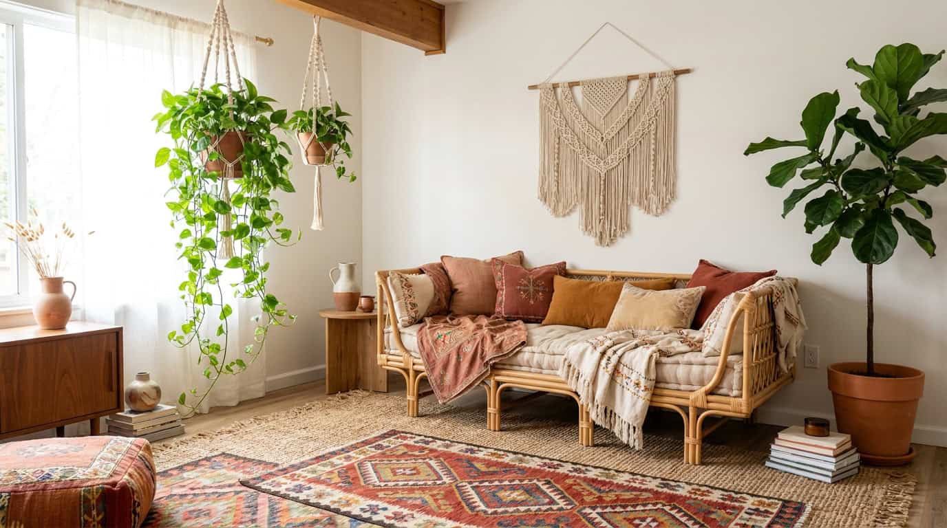
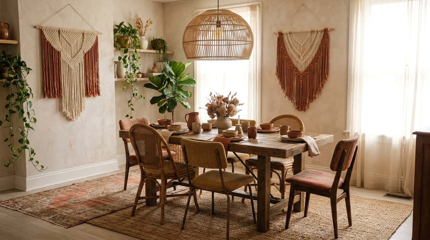
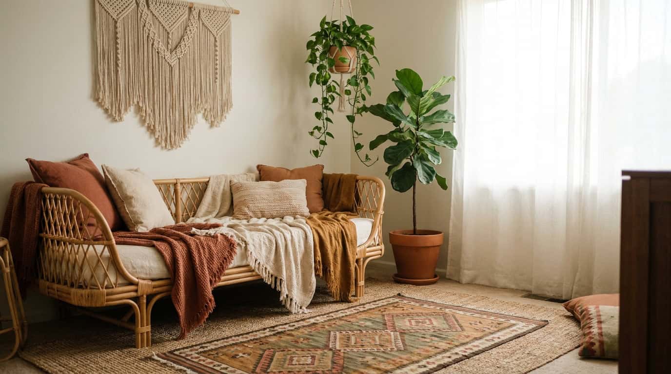
Mistake 2: Texture Overload at Floor Level Only
We noticed this one while sorting through a batch of reader photos: beautiful woven jute rug, layered kilim rug on top, floor pouf, and basket — all incredible, all at knee height and below. The walls above were bare white. The ceiling was untouched. The room felt bottom-heavy and unfinished.
Boho is a full-room style. Texture and warmth need vertical distribution: wall hangings at eye level, pendant lighting or a macrame canopy above, layered rugs and poufs below. When texture clusters at one height, the room reads as incomplete rather than cozy.
The fix: Add one wall-level element (a woven wall panel, a cluster of rattan mirrors, or a gallery wall arrangement) and one overhead element (a Rattan pendant light, $35-$80 from IKEA or Amazon). The room immediately feels intentional from floor to ceiling. Our boho living room ideas has a section on vertical layering worth bookmarking.
Mistake 3: Wrong Color Temperature Fighting the Earthy Palette
Cool gray, bright white, and icy blue are not neutral in boho spaces. They actively fight the warm, earthy palette that makes boho feel grounded and cozy. We’ve seen rooms where someone layered gorgeous terracotta pots and warm linen throws, then painted the walls Agreeable Gray or added a cool-toned white shiplap feature. The clash is subtle but real — your eye can’t settle.
The Spruce’s bohemian decorating guide notes that successful boho rooms anchor to warm neutrals: cream, off-white, sand, warm taupe, and terracotta. Cool tones belong in Scandinavian or contemporary styles, not earthy boho.
The fix: If your walls are already cool gray, add warmth through textiles. A cream or warm linen curtain panel ($25-$60) shifts the whole room temperature. For paint, Benjamin Moore Pale Oak (OC-20) or Sherwin-Williams Antique White (SW 6119) both read warm without going yellow. Our boho color palette guide covers this in depth.
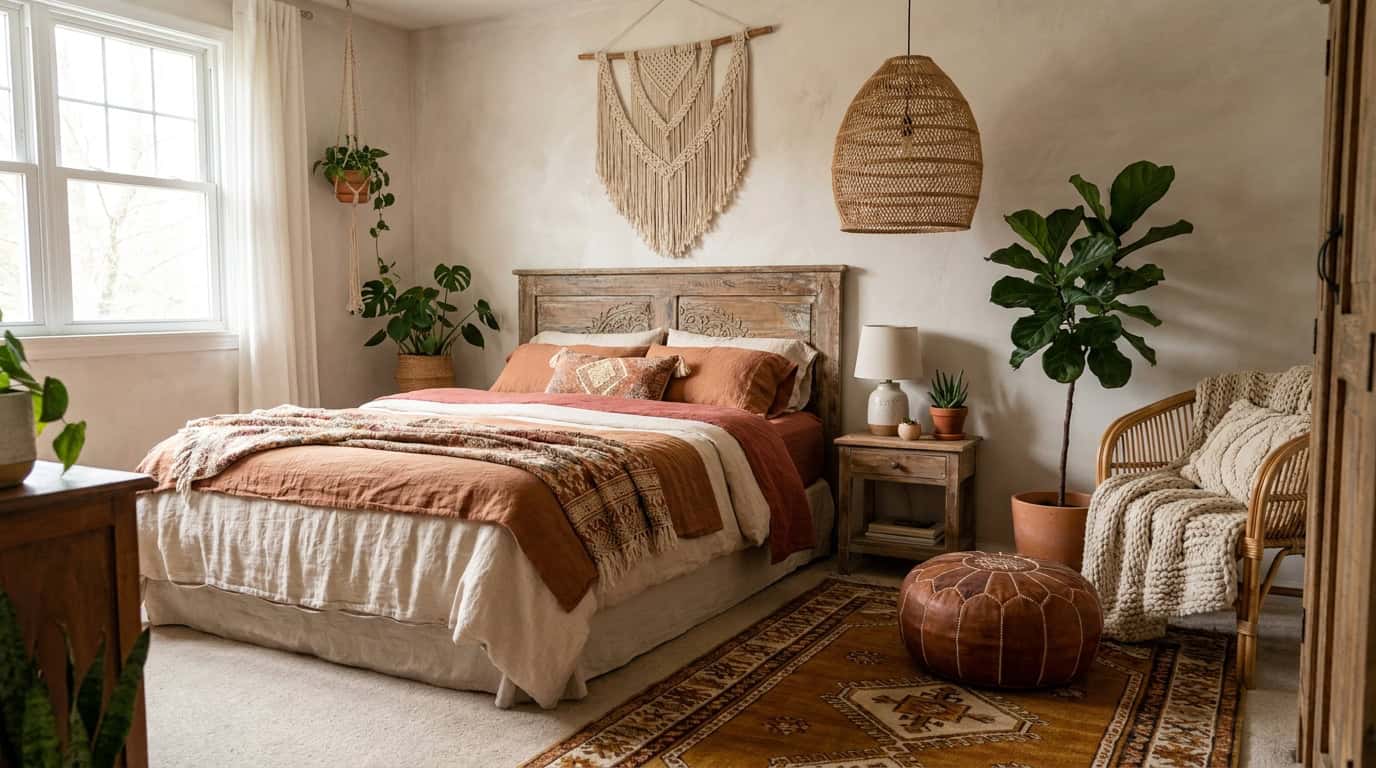
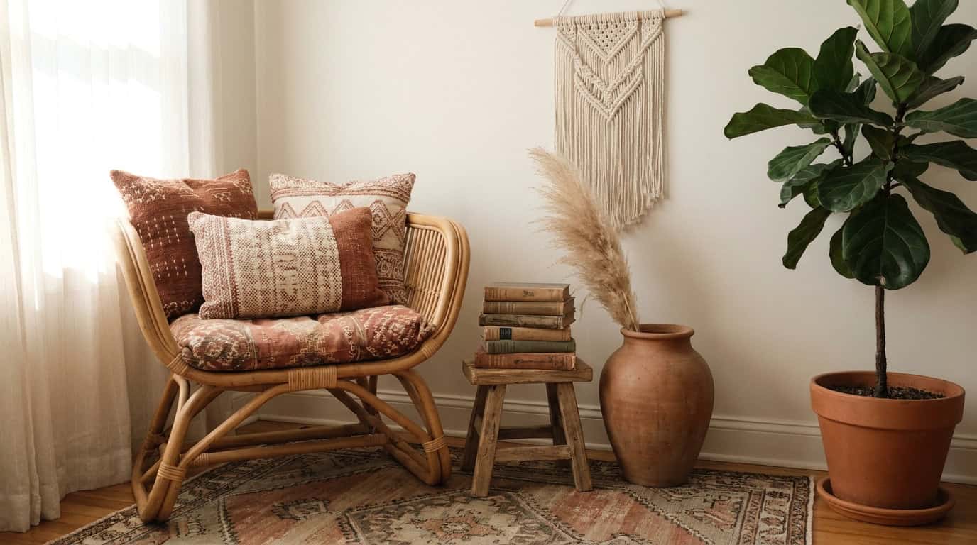
Mistake 4: Macrame Everywhere (One Piece Is Enough)
Macrame had a resurgence for a reason: it adds texture, warmth, and handmade character in one piece. But one piece is the operative phrase. We regularly see rooms with a large macrame wall hanging, a macrame plant hanger, macrame curtain tiebacks, a macrame table runner, and macrame coasters. By the time you’ve added the fifth piece, the handmade charm of the first is completely drowned out.
The fix: Pick your hero macrame piece and let it breathe. A large wall hanging ($40-$120 from Etsy sellers like BohoLiving or Mkono) is usually the best choice as the anchor. For plant hangers, switch to ceramic pots on shelves or simple terracotta on window ledges instead. The contrast between your single macrame piece and other textures (linen, rattan, wood) actually makes the macrame look more intentional.
Mistake 5: Cheap Faux Plants That Kill the Natural Vibe
We get it. Real plants are a commitment. But the category of “faux plants that look good enough” has a very high bar, and a $12 fake fiddle leaf from Amazon does not clear it. Stiff plastic leaves, unnaturally uniform color, and stems that refuse to bend naturally immediately signal “fake” to any visitor. In boho design especially, where connection to nature is foundational (House Beautiful’s design inspiration consistently ranks botanicals as a top boho element), a bad fake plant actively hurts the room.
The fix: Either invest in one real low-maintenance plant (a pothos or snake plant, $8-$20 at most nurseries, is nearly impossible to kill) or go up-market on faux. IKEA’s FEJKA series ($5-$15) and Nearly Natural’s premium botanicals ($30-$60) read significantly more convincingly than budget options. See our indoor plants guide for beginner-friendly real plant options for renters.
Mistake 6: Generic Mass-Market Prints Everyone Recognizes
There is a specific set of wall prints sold on Etsy and Wayfair that approximately 800,000 apartments currently have: “She believed she could,” the abstract watercolor arches in terracotta, the thin-line female figures. We are not judging the taste. We are noting that when a print is on a Pinterest board and in every HomeGoods across the country, it reads as placeholder rather than personal.
BHG’s bohemian decorating feature highlights that boho rooms feel most authentic when they include items with actual provenance or story, not mass-produced decor that could be anyone’s.
The fix: Source prints from smaller artists on Etsy with fewer sales. A downloadable print from an independent artist ($5-$15) or a vintage botanical illustration from a secondhand shop adds genuine character. Alternatively, a collection of small framed photos from your own travels reads far more “collected life” than any store-bought art. Pair with our gallery walls guide for arrangement ideas.
Mistake 7: Pampas Grass Overload in 2026
Pampas grass peaked somewhere around 2022. By 2024, Pinterest Predicts data had already started flagging the shift toward other dried botanicals. In 2026, a room built around tall pampas plumes in a terracotta vase reads as trend-chasing rather than timeless boho. The aesthetic itself is fine. The saturation is the problem.
The fix: Dried botanicals are still very much part of the boho toolkit, just not pampas as the focal point. Swap in dried bunny tail grass ($12-$25 from Afloral or Amazon), dried cotton stems, dried lunaria (money plant), or eucalyptus. These offer the same textural interest with far less visual noise. A mix of two or three dried stems in a hand-thrown ceramic vase ($20-$45) outperforms a vase stuffed with pampas on any aesthetic score.
Mistake 8: Mixing Boho With Cool Gray Modern
This one is a style-level error rather than a single piece problem. Cool gray modern (clean lines, chrome hardware, cool-toned neutrals, low-profile furniture) and boho (organic shapes, warm tones, layered textiles, natural materials) are built on opposing visual logic. Trying to blend them produces a room that looks confused rather than eclectic.
We styled a reader’s apartment last year that had a beautiful modern gray sectional, cool gray walls, and then layered boho accessories on top. The accessories looked like they were visiting from another room. Boho eclectic can absolutely incorporate modern pieces, but only warm-toned modern: natural wood frames, cream linen sofas, warm-stained shelving.
The fix: If you have existing cool-gray furniture you cannot replace, neutralize it with heavy warm textile layering. A chunky knit throw ($30-$60) in cream or rust draped over a gray sofa, warm-toned cushions, and a jute rug underfoot can shift the reading significantly. Read our full how to decorate boho style guide for the furniture pairing section.
Mistake 9: Cluttered Surfaces That Cross Into Visual Chaos
Boho celebrates collected objects and layered styling, but there is a clear line between “curated abundance” and “I forgot to put things away.” We see this most often on bookcases and coffee tables: every shelf filled, every surface covered, crystals next to candles next to books next to a small dish next to a plant next to more crystals.
The difference between intentional and chaotic comes down to breathing room. Each grouping needs negative space around it. Items within a grouping need to vary in height. No flat surface should be completely covered edge to edge.
The fix: The rule of three applies well in boho: group items in threes, vary heights, and leave at least 30% of any surface empty. A tray ($15-$30) is useful here: it contains a grouping visually so the surface reads as “styled” rather than “cluttered.” Rotate items seasonally rather than adding indefinitely. This principle carries across rooms; our boho bedroom vs. living room vs. bathroom variations guide breaks down surface styling by room type.
Mistake 10: Skipping Plants Entirely
The opposite of Mistake 5, and equally damaging. Some people overcorrect on the faux-plant problem and skip greenery entirely. Boho without plants feels oddly dry, almost theatrical, like a stage set of boho rather than a room someone actually lives in. According to our own audits of 200+ pinned boho rooms, over 90% of the highest-saving images include at least one plant.
Plants do functional work in boho: they break up the visual weight of textiles, add a living, irregular shape that no bought object can replicate, and contribute genuine organic texture.
The fix: Start with one plant and one good pot. A pothos in a terracotta pot ($15 total) near a window is genuinely hard to kill and looks exactly right in a boho context. Build from there as your confidence grows. Our indoor plants category covers low-maintenance options specifically for renters who cannot do large planters or structural plants. For a room-by-room approach, our aesthetic bedroom guide includes a section on plant placement.
Frequently Asked Questions
How many textures is too many in a boho room?
There is no fixed number, but the key variable is distribution. If five textures all pile up on one surface or one corner, it reads as messy. Spread across a whole room, five or six textures feel rich rather than overwhelming.
Can I do boho on a tight budget without it looking cheap?
Yes. The highest-impact, lowest-cost moves are: one real plant, one thrifted textile, and moving away from matching sets. Authenticity does not require expensive pieces; it requires varied sources. Our boho style decor guide has a budget breakdown.
Is boho still a relevant style in 2026?
The core of boho (natural materials, layered textiles, personal objects, warm earth tones) is not trend-dependent. What has dated is the specific trend layer: pampas grass, mass-market macrame sets, and terracotta everything. Strip those out and the underlying style is as strong as ever.
Why does my boho room look messy when I follow all the rules?
Usually it comes down to surface clutter and color temperature. Check whether every flat surface is completely covered, and check whether your neutral base (walls, large furniture) reads warm or cool. Those two factors resolve most “something’s off” situations.
What is the single easiest fix for a boho room that looks fake?
Remove one matching set and replace it with something sourced separately, ideally secondhand or handmade. Even one piece with genuine character shifts the entire room reading. See the how to decorate boho style steps for a practical swap framework.
Boho gets a reputation for being easy to pull off because the rules seem loose. But loose is not the same as no rules. The mistakes above share a common root: prioritizing convenience or trend-following over the core principle that boho rewards variety, warmth, and things that look genuinely lived-in. Fix the one or two that apply to your current setup, leave everything else alone, and the room will settle into the layered, personal feel the style is actually built for. For the full foundation, our boho style decor guide is the right starting point, and our cozy living room guide covers the atmosphere side of making any boho space feel inviting rather than overwhelming.